Inspiration
Five key monochrome trends
Looking for ways to use monochrome in your designs? Get inspired with our top five trends.
Focussing on either black and white or varying shades of one colour, monochrome is a trend almost as old as design itself and is a stunning and versatile choice for artwork.
Simple, striking and with limitless possibilities, there are countless ways to use monochrome in your designs- from straightforward, business-friendly content, to enigmatic wedding stationery. And let’s not forget the versatility of White Ink.
Let’s get you on-trend.
Getting creative with White Ink
Let’s start with colour. White is often a key shade in monochrome designs and if you’re looking for a truly crisp bold shade, then White Ink is a great choice.
Once only possible by leaving parts of your design blank, now we carefully build up layer upon layer of our specialised ink until the bright white of the design truly stand out from the material it’s printed on. To really highlight the tone and quality of the White Ink, we have curated a selection of six highly pigmented papers solely for this shade- perfect for adding striking white patterns.
Monochrome Business Cards
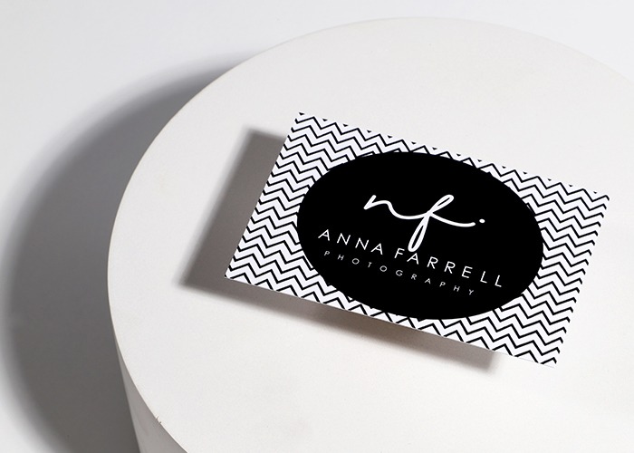
Small in size but mighty in impact, your Business Card can be the first impression a client has of you and your business. A monochrome design is an easy way to make a statement.
A black and white colour pallet helps highlight important information and is a simple way to create a professional-looking design. Contact details and logos can standout solidly from the background and patterns gain more intrigue when they’re printed in such contrasting colours. When coupled with a thick paper stock or finishes like rounded corners, it gives a modern, luxury finish and a look that’ll leave a lasting impression.
Monochrome Leaflets & Flyers
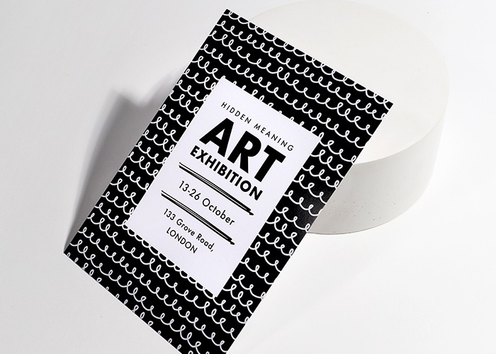
Got something to shout about? Let monochrome help your message stick. From handouts to adverts, catch the eye of passers-by and make your presence known with clean, bright messaging against a rich, block-coloured background. Monochrome has an air of simple sophistication, perfect for giving events and promotions a high-class feel. For a design that really grabs attention, consider having your design or pattern subtly fade from one colour to another- a simple yet effective way to add more visual drama to your promotions.
If you’re looking for a little extra inspiration for your Leaflet & Flyer designs, check out our guide here.
Monochrome Wedding Suites
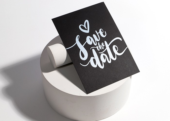
Weddings might be some of the most colourful days of our lives, but that doesn’t mean you can’t enjoy the simplicity of Black, White and Grey. From adding greyscale floral designs to your suite to using just one colour for your patterns and designs, there are plenty of ways you can incorporate classic wedding imagery in your print while adding a monchrome twist.
For an extra surprise when sending your post, try a striped Envelope Liner. A perfect addition to any monochrome wedding suite, when your recipients see it tucked into their Envelope, it will help set the tone for the big day before they’ve even read the Invitation!
Why not try a black and white floral design? Adding simple black floral design printed down the edge of a white paper stock creates a delicate accent- perfect for adding to Save the Dates or an Order of Service.
Bold, calligraphy also works well in monochrome wedding designs. Having the spouses names or the date of the wedding in large, sweeping calligraphy against a contrasting background gives a luxury feel- especially when coupled with a textured paper stock.
Add a little colour
Monochrome doesn’t just mean black and white. While the two colours contrast amazingly against each other, it gives you a simple, neutral backdrop so you can easily incorporate other finishes and colours without the design getting overwhelmed.
You could use Foil to highlight names or logos and draw attention to certain aspects of the design. Gold and copper foil contrast wonderfully against Black or grey designs. Available in a range of shiny metallic shades, it gives a high-quality feel to all kinds of print
You could also add a little colour to greyscale designs to add intrigue. Simply choose one aspect of your artwork to be coloured or add a small splash of several colours across your design- a great way to add some sophisticated charm.
Monochrome works well on all kinds of print, so why not get experimenting with your designs?
Get next-day print on loads of options and products at Printed.com – perfect for when you need to get your print, fast.
London based? Get same-day print on a range of options too! See all of our delivery options here.
About the author
Our in-house designer Becca has a love of all things creative. When she’s not designing, you can find her in Newcastle checking out independent coffee shops or getting her hands dirty with her house renovation.