#ProudlyPrinted, Inspiration, Spotlight
#ProudlyPrinted- The Typography Edition
Welcome to the Typography Edition of #ProudlyPrinted!
This month we’ve been looking at all things script. With our #ProudlyPrinted Typogprahy competition on our social media, we thought it time to highlight some of our favourites.
Want to see your designs here too? Tag us on social using #ProudlyPrinted!
AVTypography
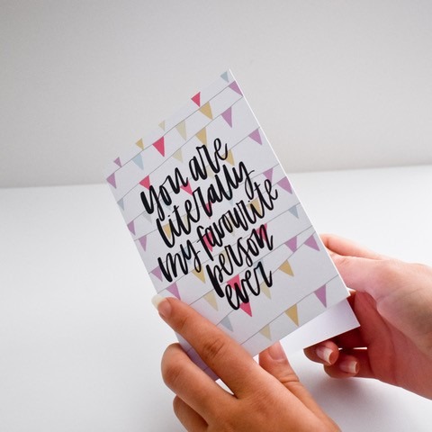
This fantastic print is courtesy of the ever-lovely Amy from AVTypography. A keen hand letterer and photographer, Amy’s designs exude everything simple and sweet. Inspired by the work of other creatives, she quickly found her own unique style. It’s clearly showcased in each piece of her work.
Docjoyed
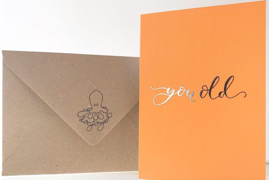
Shining with gold foil, Ben Gerrish of Docjoyed takes great pride in hand-writing all of his designs. While this does leave more room for error, he sees it as an extra-special touch, happy that a little bit more time has gone into making each piece perfect.
Honey & Velvet Studio
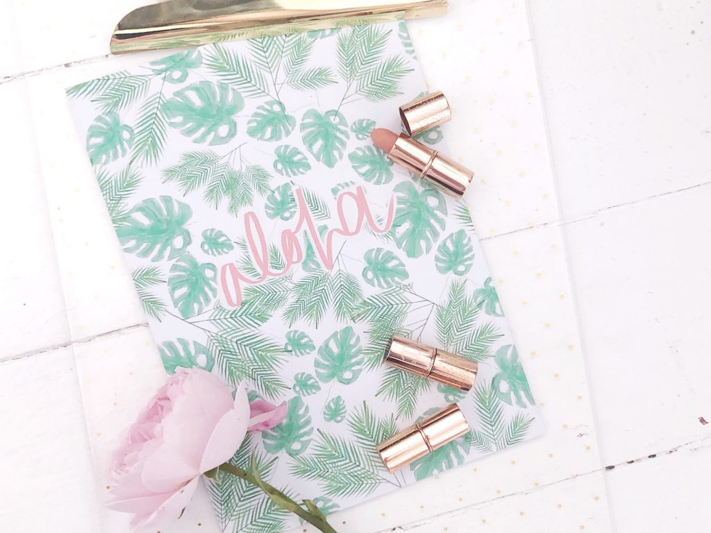
This colourful and sweet typography by the wonderful Honey and Velvet Studio is a great example of how to really make your designs pop! Paired with a funky pattern, this tropical print is a real standout! Carefully hand-drawn, Jessica’s designs usually start as pen and ink drawings, which she then recreates digitally before printing them onto high-quality Recycled paper. We can’t get enough of them!
Cutie and the Feast
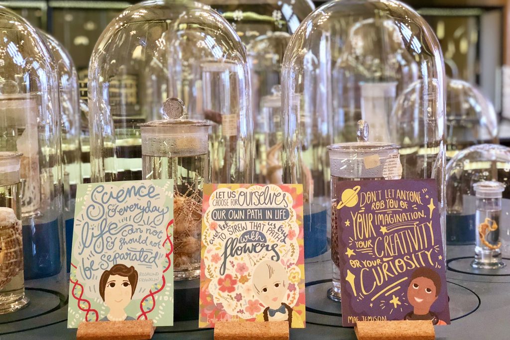
Cutie and the Feast are not a stranger to our blog, and we’re absolutely in love with these fantastic postcards celebrating women in science! Running her store as a side-hustle alongside her role as a researcher, Nicola is well known for her fun colourful designs and her passion for bringing science to the masses in an accessible and interesting way. The flowing typography used here is a great example of how to use longer quotes in a visually interesting manner.
StephHoweStudio
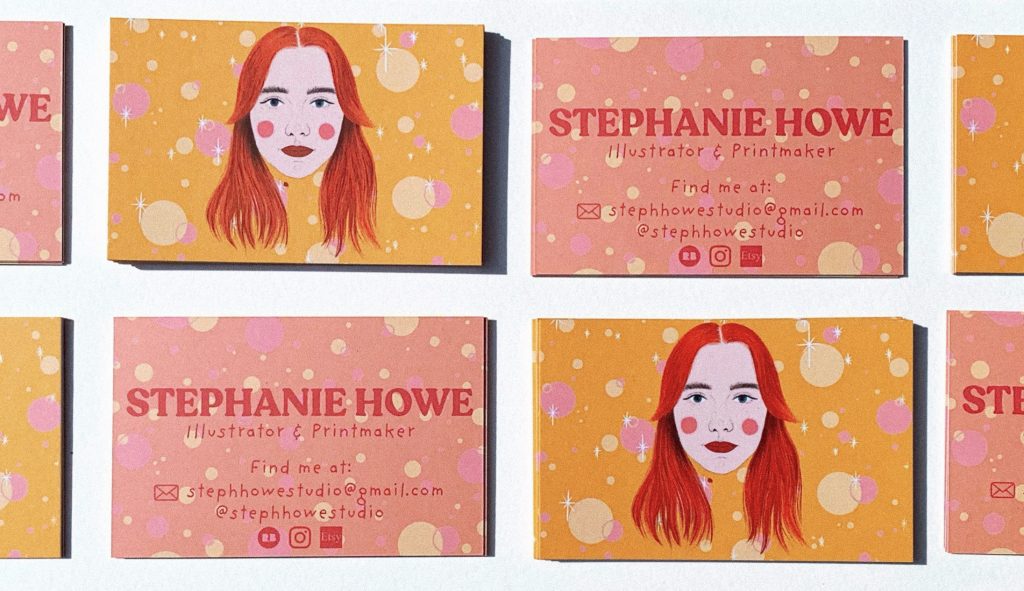
This bold and colourful typography by Stephanie Howe shows the right way to make your Business Cards grab attention! Specialising in bright, statement prints, she always makes sure that the script she uses fully reflects the rest of the design. She usually gravitates towards fun, retro typography that really packs a punch for names or headings. The less in-your-face textured and wiggly hand type to give her work a more handmade feel.
Squaire UK
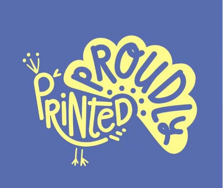
We also have to give a special shoutout to the winner of our #ProudlyPrinted Typography competition- Squaire UK!
When it came to choosing a winner, it was a really tough decision as there were so many fabulous entries! However, the imagination and overall flair of this proud peacock really won us over. so We were more than happy to award them the crown!
We hope you enjoyed our #ProudlyPrinted – The Typography Edition
Remember, if you fancy a slice of the action, just tag us in your printed creations on Facebook, Instagram and Twitter and use the hashtag:
While you’re here, why not check out some other #ProudlyPrinted creations like our Eco and Pride editions?
About the author
Meet Drew! As part of the Printed.com marketing team, Drew spends her days crafting content. When she’s not working her magic on marketing, you’ll find her enjoying quality time with her daughter and her furry friend, Archie.