Inspiration
Meet the paper: Tintoretto Gesso
Tintoretto Gesso is one of our long-time favourite paper stocks! This luxurious paper is perfect for Wedding Invitations, Greeting Cards, Postcards and more.
Illustrative, watercolour and calligraphic designs love a textured paper stock, so this specific paper is perfect if you’re keen to evoke a more hand-crafted feel to your prints.
Ready meet this fine Italian paper?
Get to know Tintoretto Gesso
With a soft honey hue Tintoretto Gesso is an uncoated paper with a lightly hammered texture. Available in 250gsm or 300gsm, its creamy, warm base means printed colours will appear soft and slightly muted. Made with FSC® certified, Tintoretto Gesso has some pretty impressive eco credentials too!
Our Gesso paper is available in Tintoretto and Fresco. Fresco is a brighter, whiter version of Tintoretto – so if you’re looking for a similar texture, but a fresher finish, check out Fresco instead.
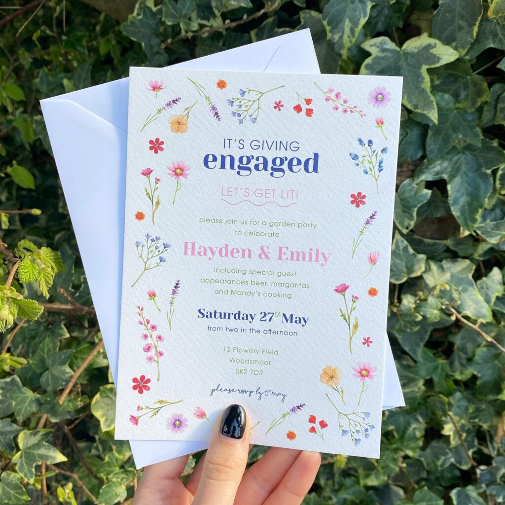
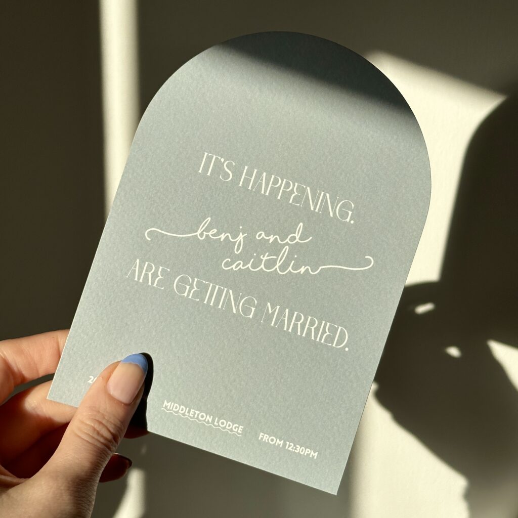
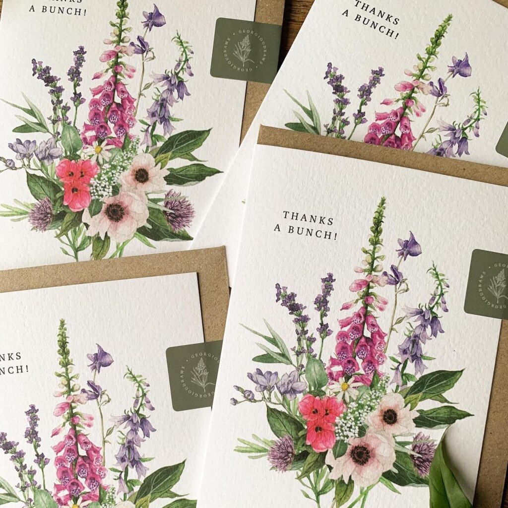
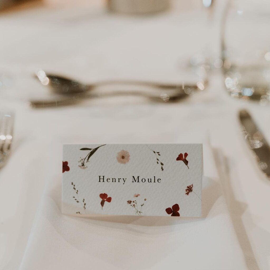
Fancy using it in your designs? Take a look at how our customer’s are using it!
Ready to get creative with our papers? No matter what your next project is, explore our full range and find your perfect match. Want to feel them for yourselves? Order a free Sample Pack below.
About the author
Nathan is one of our designer’s. The go to guy for all things art direction, typography and trends. He has a passion for colour (check out the jumper), a well poured pint of Guinness and Harry Styles.
Comments are closed.