Inspiration, Tips and Advice
Understanding the psychology of typography
Understanding the psychology of typography is a powerful tool in any graphic designer’s arsenal.
If you’re a designer or creative then you’ve probably spent hours sifting through different typography styles, in order to find that perfect one for a customer or client.
But how do you know which font to pick when designing for a brand, business, piece of promotional material or, well, just about anything?
A simple font change can drastically affect a piece of artwork or document, but what is it about typography that can change a perception so quickly? We’re going to take a look at the psychology of typography, its importance, and how knowing your stuff can make all the difference when it comes to design – so settle in, grab a cuppa, and get ready to take a wordy-journey through serifs, letterpress, branding and perception.
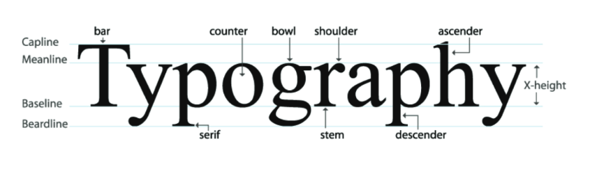
First up, what is typography?
Typography and graphic design go hand in hand; after all, there is no denying that typography is an art form. A mixture of good skills, good taste and a keen eye will ensure your work as a typographer doesn’t go unnoticed. But this art form is more than just being able to pick out a certain font that looks good in your designs.
Although the font or typeface used does pay an imperative part, typography is so much more than making a good choice. Typography has a lot bigger responsibility than just looking pretty on paper… Don’t believe us? Keep reading…
Telling stories with type
The great thing about mastering typography is that you can effectively tell a story, through its use. The correct typeface, for example, can completely change a consumer’s perception of a brand.
Bruno Maag, Foudner of Dalton Maag wrote an impressive article on this perception, (you can read it here) – and he quotes from the research of Poffenberger & Franken, who uncovered that:
“people responded almost uniformly to typeface and product combinations, and mostly used similar adjectives to describe what they felt about the different fonts they were asked to comment on”.
Interesting, huh? Fonts aren’t as subjective as say, colours, or images…
Ok so where does that leave us?
You’ll notice that big brands like say Apple, or tech brands often choose geometric fonts with homogenised proportions – as these tend to represent design purity, cleanliness and simplicity – values that many technology brands are currently keen to express.
Consumer banking also offers an interesting example, as these brands have been progressively moving away from authoritarian serif designs in favour of softer expressions, perhaps to appear more human and friendly as they aim to rebuild trust following the financial crisis.
Now let’s take a look at some other big brands…
![]()
Lego’s logo has remained unchanged since 1998 – and if we break down the components of the design, we can see how this typographic choice empowers the brand, and sums up its values in one fell swoop.
The lettering and typeface has been designed to convey fun. There’s no sharp edges of clean lines (despite the fact that it’s product is made up of these very things!). It’s been considered and created to convey creativity, yet simplicity. The logo is recognised worldwide, and a key factor to note is that it is unique in its creation. If you removed the colours, or even the words (for example, typed four different letters, instead of LEGO), it would remain recognisable and impactful.
![]()
British Airways have used this logo since 1997.
The logo typeface has been designed to convey an air of authority and superiority. With slight, yet defined serifs and capitalisation, the brand manages to bring forth their values of service and quality – all from a typeface choice!
Let’s make a direct comparison to easyJet – another airline, yet a very different conclusion on brand values and brand identity is reached simply through its logo typeface and font choice.
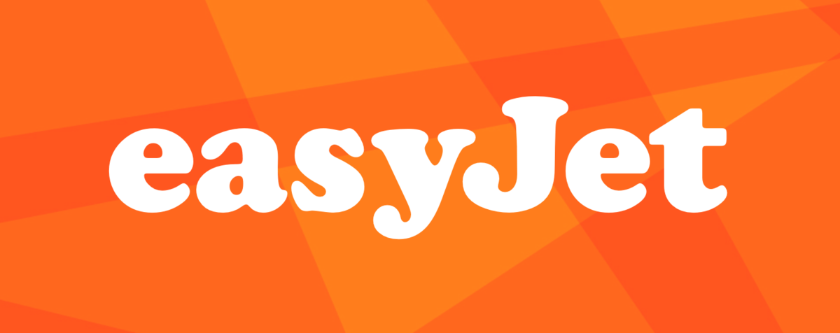
Bold, rounded letters bring forth a feeling of fun. Having only been established sine 1996, this young brand needs to encapsulate its origins with something that doesn’t make a false claim to credibility or established quality. Famed for low fares and ease of travel, their logo summarises their values, and their brand colours only further enhance them.
Font styles – what are they and what do they mean?
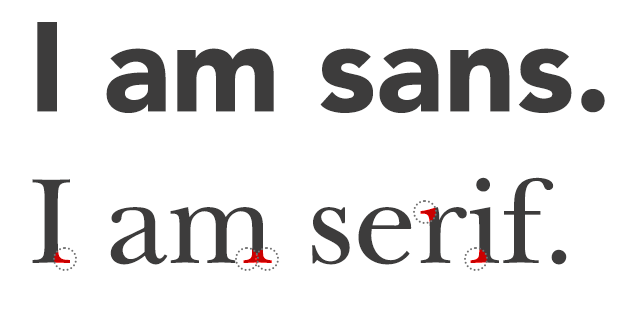
Serif
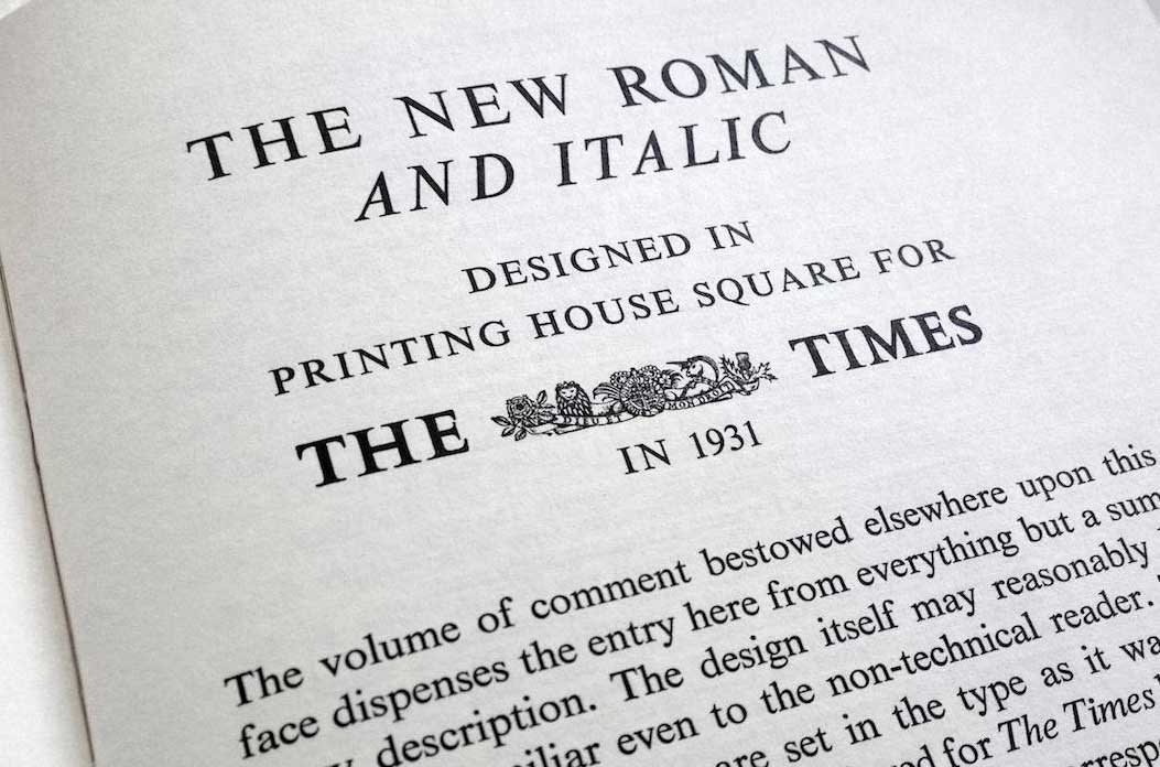
A serif is a small line attached to the end of a stroke in a letter or symbol. Fonts such as Times New Roman and Georgia are some of the most widely recognised serif fonts in the world. A serif typeface is usually used in branding to imply grandeur, tradition and even garners respect. Yale, Time Magazine and The New York Times all use Serif to highlight their authority, (and, just as we saw above, so do British Airways).
Sans Serif
The direct opposite is ‘Sans Serif’ which basically means ‘without serif’. Fonts like Arial and Calibri are popular sans serif choices. Serif fonts are easier to read at small sizes, as they guide your eye along a word, so its best to stick to serif fonts for a lot of text and sans serif for headlines and larg amounts of text.
Script
Another popular font family, although used in a far different way from our last example. Script is far more feminine and creative, creating intrigue in consumers. Lucida, Pacifo and Brush Script are all fine examples from this family and ones you’ll see on a regular basis. Where? Take a look at Cadbury and Coca-Cola for Script typography.
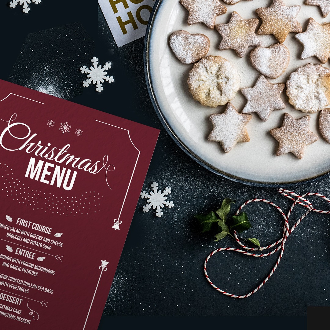
The menu above combines ‘Christmas’ in a serif font, with a bold sans serif for the rest.
These are just some of the typography and branding examples we think are the most impressive, although there are dozens more of them everywhere you look. The next time you’re out and about cast your eye over the hundreds of different typography combinations. By understanding the psychology of typography, and its importance in branding, you’ll be able to make better choices when it comes to your own designs and artwork.
Here at Printed.com, we’re lucky enough to see hundreds of designs pass through our presses – and that means an abundance of varying typefaces and fonts too. But, we’ve all got our favourites – so we asked our design team to tell us what makes them tick and what their favourite fonts are…
Marius – Head of Creative at Printed.com
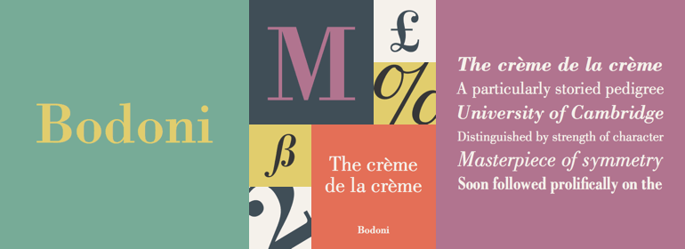
Bodoni
“So elegant and timeless, this typeface is synonymous with style and fashion. I love it because every letter is a piece of art in itself. The contrasting weights of the letters and the hairline serifs is a reflection of the technical skill of the creator Bodoni himself. It is filled with everything a typographer could wish for: rhythm, style and clarity.”
Amel – Designer Printed.com
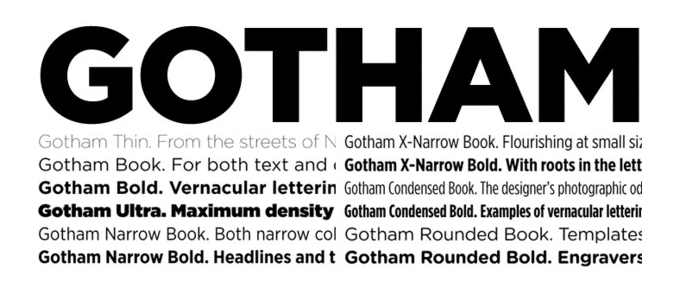
Gotham
“It’s very versatile, and I think it’s very solid, geometric nature brings structure when going for bold layouts. Fun fact: It’s the font Obama used on his “HOPE” campaign posters.”
Emma-Lee – Content Manager at Printed.com
Times New Roman
“I love the traditional Times New Roman font, both for its readability and its underrated simplicity. I’m intrigued by its attention to detail in its tiny serifs that aren’t usually appreciated when viewed at size 12 in a Word Document’.
What’s your favourite font? Or do you have any tips to share about the psychology of typography? Let us know!
Why not tag us in your typographic creations on Instagram? We’d love to see! Just use #ProudlyPrinted.
About the author
Our in-house designer Becca has a love of all things creative. When she’s not designing, you can find her in Newcastle checking out independent coffee shops or getting her hands dirty with her house renovation.