#ProudlyPrinted
#ProudlyPrinted – The Colour Trends Edition
This week, it’s all about colour trends! Earlier this week we took a look at what’s coming next year when it comes to colour, with our roundup of the Pantone Colour Trends Report. (You can read it in full here).
To help you get inspired to flex your colourfully creative muscles, we took a look at how some of our customers are already using next season’s hottest shades.
From gorgeous handcrafted designs to cutting edge modern minimal, we get to see all kinds of creative pieces pass through our presses. Want to see your designs here too? Tag on social using the hashtag #ProudlyPrinted!
Lavender and Lace – Shade: UltraViolet
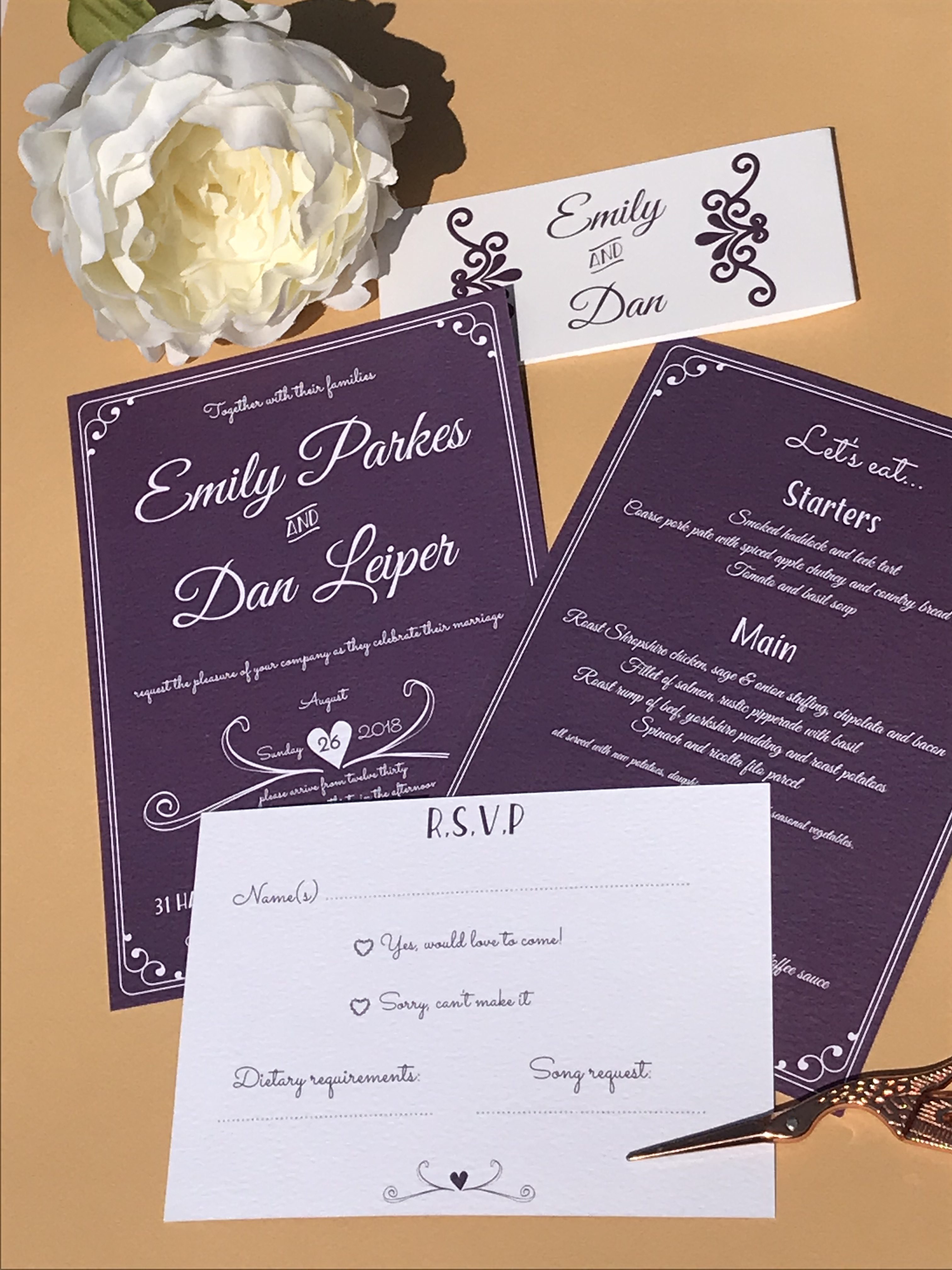
Image credit: Lavender and Lace
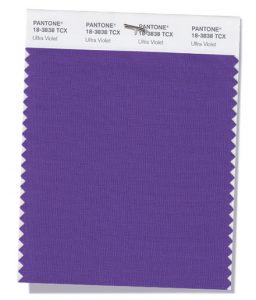
Image credit: Pantone Colour Report 2018
Lavender and Lace created this stunning suite, featuring the on-trend shade: Ultra Violet. Ultra Violet brings a soft, mysterious romance to Wedding Invites and we love the contrast between the deep purple and fresh white.
Samantha King Design – Shade: Limelight
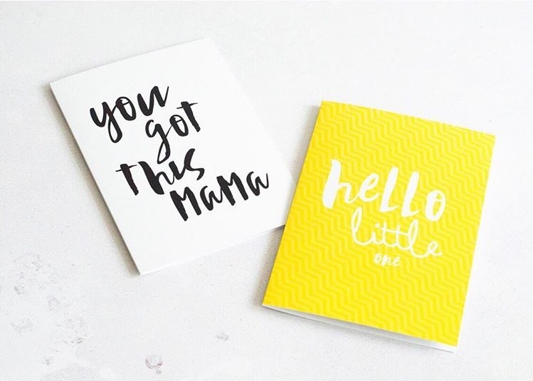
Image Credit: Samantha King Design
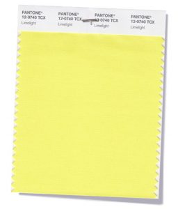
Image credit: Pantone Colour Report 2018
Samantha King combines texture with a zingy bright yellow shade to create her new baby Greeting Cards. Perfect for summer and even more perfect for brightening up grey days, yellow is set to be huge as we transition into 2019.
Fawn Creative – Shade: Ceylon Yellow

Image credit: Fawn Creative
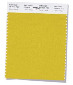
Image credit: Pantone Colour Report 2018
Ceylon Yellow takes a softer approach than Limelight, but is equally as beautiful. Evoking warm, gold hues, it’s ideal for the transition from Summer to Autumn, and we reckon Fawn Creative has it nailed with these golden-toned birthday cards. Keeping it simple with bold typography these beautiful cards let the colour do the talking.
A Letter in Time – Shade: Nebulas Blue
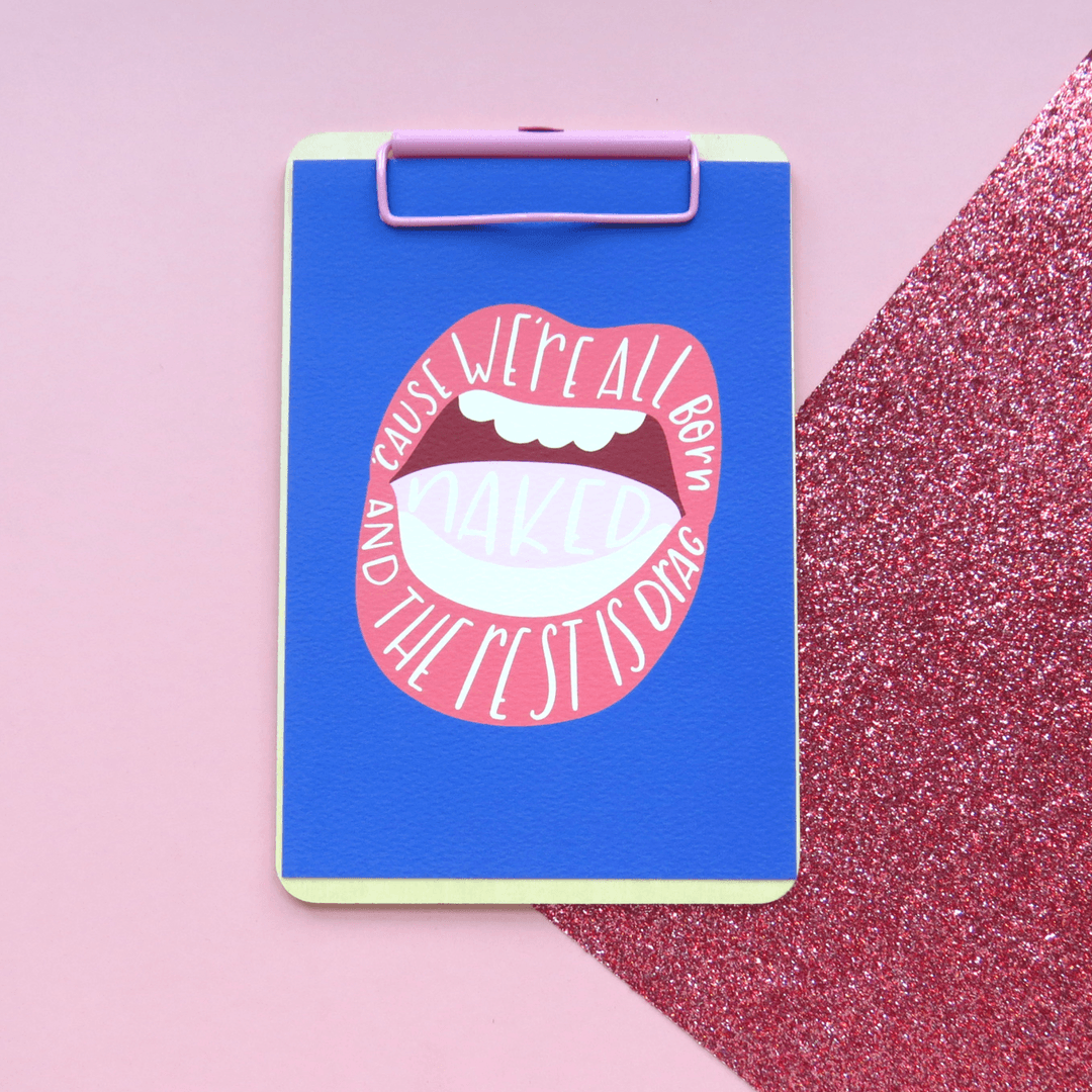
Image credit: A Letter in Time
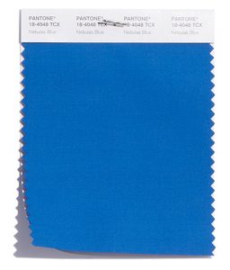
Image credit: Pantone Colour Report 2018
Nebulas Blue is a striking shade for 2018 and we love how A Letter in Time conquers this bold blue hue. Ideal for graphic prints, stunning on stationery and an awesome addition to bold and bright Wedding Stationery, we’re looking forward to seeing how you use this daring colour in your designs into 2019!
Sam Warner – Shade: Mellow Rose
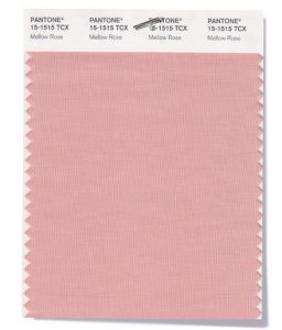
Image credit: Pantone Colour Report 2018
Evoking millennial pink, Mellow Rose is here to stay well into 2019. Sam Warner nails the trend with her wedding day cards, featuring cute illustrations and hand-written typography. We think this shade would work absolutely anywhere, on anything, and well… everything, but we think it works particularly well on Greeting Cards.
Emma Traynor – Shade: Martini Olive
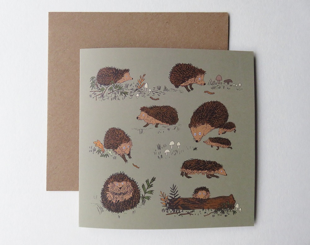
Image credit: Emma Traynor
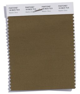
Image credit: Pantone Colour Report 2018
Martini Olive brings that warm autumn feeling, and we love how Emma Traynor has used it with her utterly adorable hedgehog illustrations to create her Greeting Cards. A soft, dense shade which will no doubt prevail in fashion over the next season and into next year, we love how it transcends into stationery and design!
We hope you enjoyed our #ProudlyPrinted – The Colour Trends Edition
Remember, if you fancy a slice of the action, just tag us in your printed creations over on Facebook, Instagram and Twitter and use the hashtag:
While you’re here, why not check out some other #ProudlyPrinted creations with our Artist and Bespoke edition?
About the author
Meet Drew! As part of the Printed.com marketing team, Drew spends her days crafting content. When she’s not working her magic on marketing, you’ll find her enjoying quality time with her daughter and her furry friend, Archie.