News
Your colour trend update for A/W 2018
Let’s talk colour trends for A/W 2018!
Each season the team at the Pantone Colour Institute creates the Pantone Fashion Colour Trends Report. An indicator of what’s coming and the top colours that you can expect to see showcased by fashion designers at London Fashion Week in the upcoming season. With colour on the catwalk a key indicator of the colour stories we can expect to see showing up across all areas of design, the Pantone Fashion Colour Trends Report is your easily accessible guide to the season’s most important colour trends. (Read the full report here).
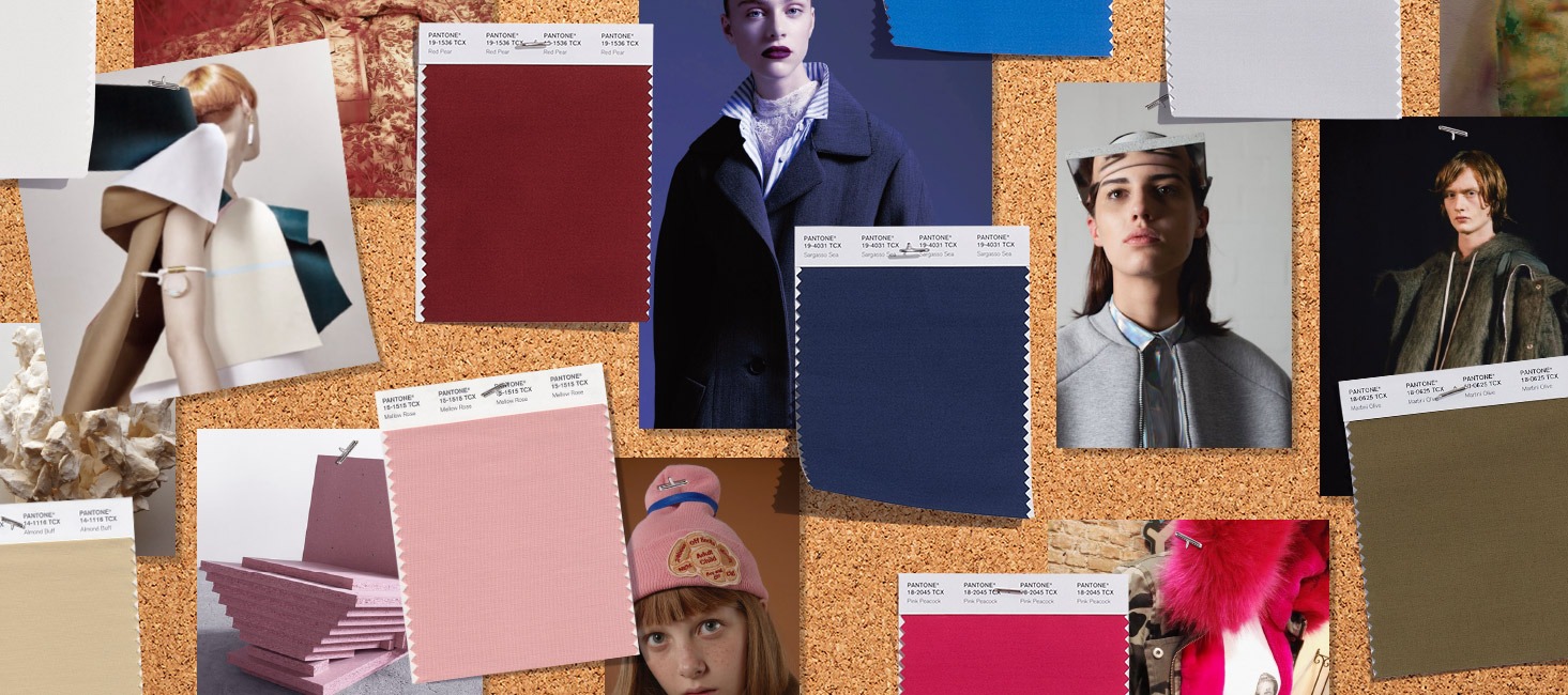
Image credit: Pantone Colour Report 2018
To help you navigate the trends, we’ve highlighted some of the most exciting colour trends for A/W 2018 and well into 2019 – they all look set to have a huge impact next year…
Reds and oranges
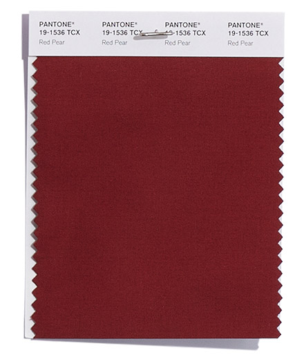
Image credit: Pantone Colour Report 2018
PANTONE 19-1536
Red Pear
Deliciously deep red, whose luscious depth entices.
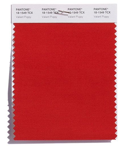
Image credit: Pantone Colour Report 2018
PANTONE 18-1549
Valiant Poppy
Brave and outgoing red shade effusive in its allure.
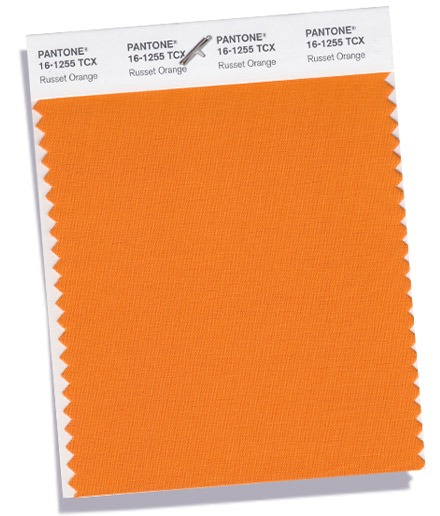
Image credit: Pantone Colour Report 2018
PANTONE 16-1255
Russet Orange
This forest floor orange speaks to earthen warmth.
Warm reds are always a popular shade for A/W – evoking the feeling of leaves on the forest floor, cosy nights by the fire and rich plumage. Whether you pare your shades down by choosing deeper variations (think; burgundy, wine, russet oranges) or use them in their brightest form to create a contrast, these shades work brilliantly with foliage designs, simple colour blocking and patterns.
Blues, purples and violet
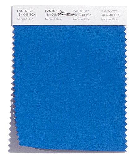
Image credit: Pantone Colour Report 2018
PANTONE 18-4048
Nebulas Blue
Reminiscent of twilight, a thoughtful, starry-eyed blue.
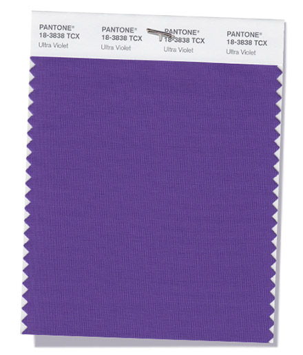
Image credit: Pantone Colour Report 2018
PANTONE 18-3838
Ultra Violet
Inventive and imaginative Ultra Violet lights the way for what is yet to come.
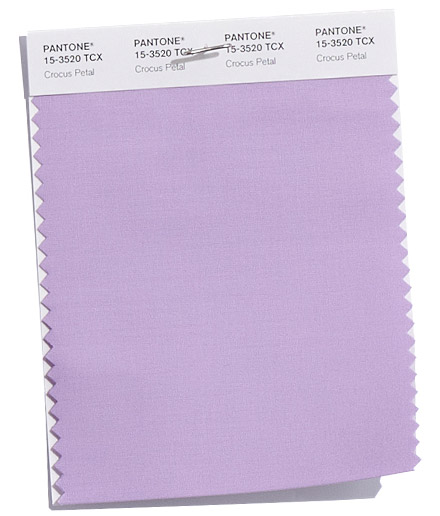
Image credit: Pantone Colour Report 2018
PANTONE 15-3520
Crocus Petal
A cultivated and refined hue adds a light and airy spring-like feeling demand.
Get in the twilight zone with these gorgeous hues! Ultra Violet is 2018’s signature shade, and it’s not going anywhere for A/W2018. Ideal for pairing with deeper, darker shades, create some intrigue and mystery with these sophisticated shades.
Yellows
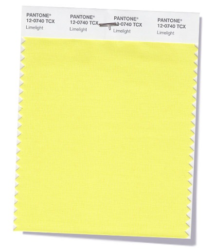
Image credit: Pantone Colour Report 2018
PANTONE 12-0740
Limelight
Animated and effervescent, a pungent yellow-green becomes the center of attention.
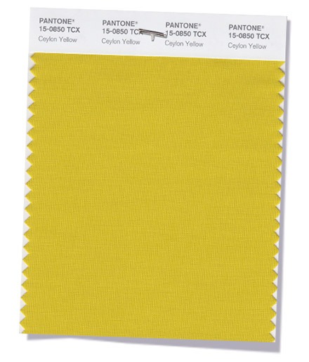
Image credit: Pantone Colour Report 2018
PANTONE 15-0850
Ceylon Yellow
Savory and spicy yellow adds an exotic touch.
From exoctic Ceylon Yellow to the zesty bright shade of Limelight, yellow, in all its forms looks set to big this autumn, and into next spring. Bringing a much needed pop of brightness to the inevitable grey days, expect yellow to overtake everything from fashion to stationery this season.
Greens
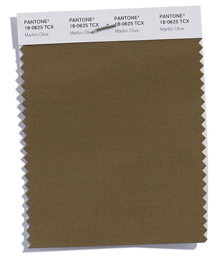
Image credit: Pantone Colour Report 2018
PANTONE 18-0625
Martini Olive
Smooth, sophisticated and urbane green adds depth to the Fall/Winter 2018 palette.
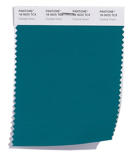
Image credit: Pantone Colour Report 2018
PANTONE 18-5025
Quetzal Green
A deep elegant blue-green hue suggestive of rich plumage.
Two striking shades feature in this trend report. The deep olive tones of Martini Olive, contrasted with the jewel hue of Quetzal Green. Both look set to dominate in A/W 2018 and well into 2019, and whilst both shades are from the same colour family – their uses in design terms couldn’t be more different. Martini Olive brings pared back, fashionable khaki warmth to designs, ideal for rustic and handcrafted elements, whereas Quetzal Green is loud and proud – perfect for accents and highlights.
Pinks
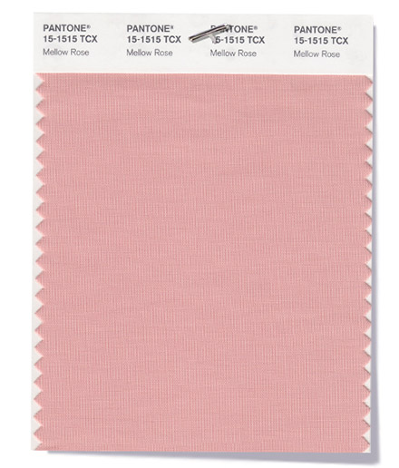
Image credit: Pantone Colour Report 2018
PANTONE 15-1515
Mellow Rose
A beloved traditional English shade adds unexpected intrigue.
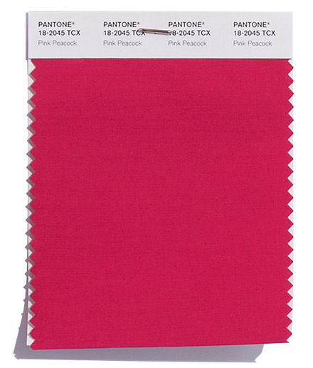
Image credit: Pantone Colour Report 2018
PANTONE 18-2045
Pink Peacock
A bright and bold dramatic pink for a more experimental approach.
Ever since the explosion of Millennial Pink, these romantic shades have dominated colour palettes. With such a variation of hues, pink can be used for almost anything – from subtle romantic designs to bright and bold neons – how you incorporate it into your own designs is truly up to you!
Feeling inspired? Shop the full range at Printed.com and start incorporating the colour trends into your own designs or check #ProudlyPrinted – The Colour Trends Edition!
About the author
Our in-house designer Becca has a love of all things creative. When she’s not designing, you can find her in Newcastle checking out independent coffee shops or getting her hands dirty with her house renovation.