Inspiration
Get inspired with the Pantone Colours of the Year- Ultimate Gray and Illuminating
It’s once again time to reveal the Pantone Colour of the Year– or should we say… colours!
The announcement of the Colour of the Year is always a dramatic time in the creative world. For the last 22 years, each chosen shade has had a huge influence across all aspects of design, including fashion, film and of course, print. From the cool tones of 2020’s Classic Blue to the vibrancy of 2019’s Living Coral, we’re always impressed with how the creative community takes inspiration for their own work, and the impact of 2021’s winner has been especially exciting to watch.
While we’ve had a blend of shades chosen before, this is the first time since it’s inception that Pantone has selected a “pairing” of colours as their Colour of the Year. Get ready to meet shades 17-5104 and 13-0647, better known as Ultimate Gray and Illuminating.
How is Colour of the Year decided?
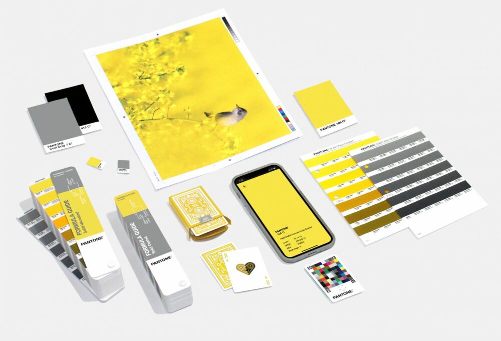
Image credit: Pantone
So what about these colours made them the shining stars of the year? And why were two chosen?
Pantone’s Colour of the Year is determined by a panel of expert judges who “comb the world looking for new colour influences” with Pantone explaining that the winning choices represent “a message of happiness supported by fortitude.”
The executive director of Pantone, Leatrice Eiseman, explains that choosing a combination of different colours “highlights how different elements come together to express a message of strength and hopefulness that is both enduring and uplifting,” calling the chosen shades, “practical and rock solid but at the same time warming and optimistic.”
With shades that are all about moving forward and rekindling hope, let’s see how you can use this pairing to bring your printed designs to the next level.
Using the Colour of the Year for print
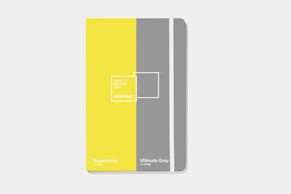
Image credit: Pantone
While the Colours of the Year were only announced a month ago, we’ve already seen a ton of creative businesses experimenting with them and showing just how effective they can be for print.
Firstly, don’t think that you have to use each colour evenly. While even block colours can look amazing (like the Notebook design above), Pantone themselves have said that these colours don’t need to be used in “equal proportions.” Pantone’s own advice states that “enduring Ultimate Gray provides a great bouncing off point with Illuminating bringing in some brightness,” so perhaps consider using grey shades for backgrounds and using the yellow to accentuate key features. This could be typography, logos or repeated patterns in your designs.
Don’t think you’re limited just to decorative pieces, however! Pantone is encouraging experimentation for all kinds of prints as “the coupling of friendly Illuminating with quietly assuring Ultimate Gray infuses a message of vitality into a firm foundation of reliability… for packaging and multi-media design,” so why not see how they could work for your other print projects. Whether it’s printing new versions of your Business Cards using these colours or creating striking yellow and grey patterns for your wall with Self-Adhesive Vinyl, there’s a world of design opportunities to explore.
Finishing touches
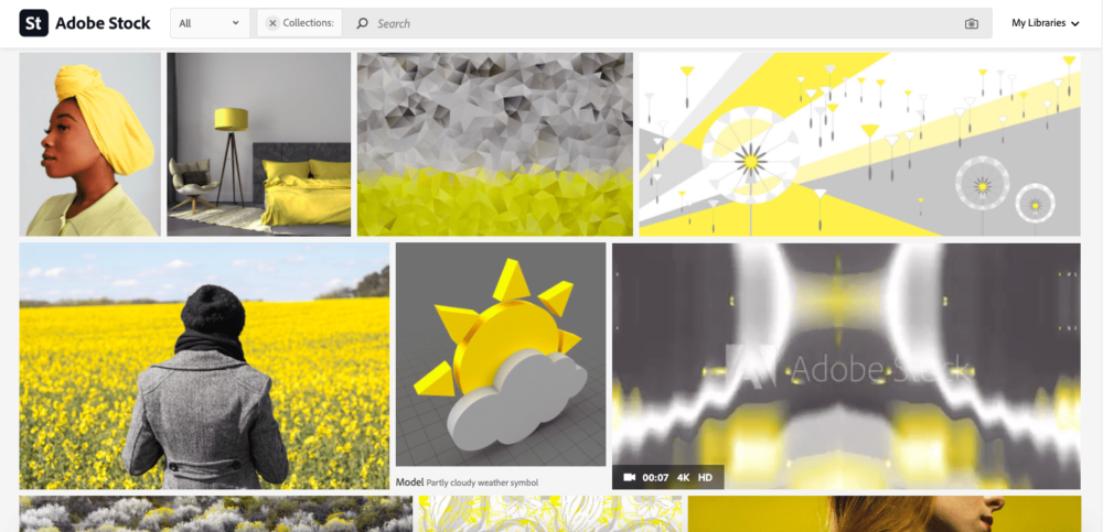
Colour of the Year inspiration on Adobe Stock
Still looking for a little more inspiration? Pantone has partnered with Adobe Stock to offer a range of hand-picked imagery for creatives which you find here. They’ve also crafted their own complementary colour pallets which you can find using their online portal here.
Don’t forget about your paper choice too! With a colour as “solar-powered” as Illuminating, keep that sunny yellow as bright as possible with vibrant papers like Kodak Photographic Paper or Hahnemühle Baryta FB for Art Prints or Gloss for Leaflets and Flyers. If you’re unsure about which stocks would look best for your projects, make sure to check out our full list of paper descriptions here or pop a quick message to our Customer Service Team who will be more than happy to help.
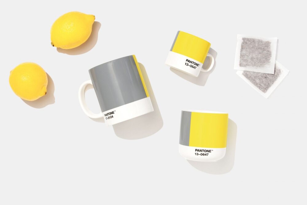
Image credit: Pantone
Ready to try these shades for yourself?
Setting up your colour
While we don’t print Pantone, you can still print these stunning shades using other colour values. Check out our approximations below so you can start designing right away.
Ultimate Gray colour values
Pantone: 17-5104 TCX (Cotton), Cool Gray 7 C (Solid Coated Ink)
RGB: 151, 153, 155
HEX/HTML: #97999B
CMYK (approximation): 44, 35, 34, 1
Illuminating colour values
Pantone: 13-0647 TCX (Cotton), 106 C (Solid Coated Ink)
RGB: 245, 223, 77
HEX/HTML: #F5DF4D
CMYK (approximation): 6, 7, 82, 0
That’s s wrap on Colour of the Year from us. Now it’s over to you! Make sure to tag us #ProudlyPrinted on Instagram and show us all your amazing Ultimate Gray and Illuminating creations!
About the author
Our in-house designer Becca has a love of all things creative. When she’s not designing, you can find her in Newcastle checking out independent coffee shops or getting her hands dirty with her house renovation.