Inspiration, News
Let’s design with the Pantone Colour of the Year- Classic Blue
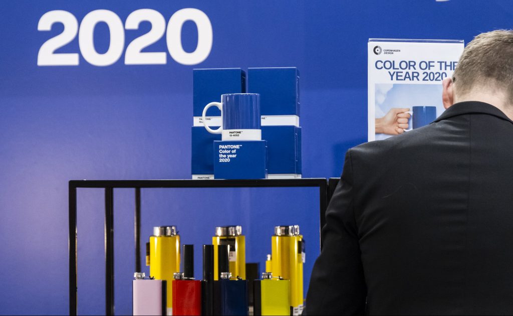
It’s Colour of the Year time! Say hello to Pantone 19-4052! Or as it’s more commonly known, Classic Blue.
As we jump headfirst into a new year, one thing is clear. Blue is THE colour to try.
From catwalks to cocktails, Pantone’s latest choice for colour of the year is spilling into all aspects of design like an overflowing sink- and we’re just itching to use it.
Described by the company as a ‘universal favourite’ shade it was chosen because of it’s ‘reassuring presence instilling calm, confidence and connection.’ A bit of a departure from last year’s ‘animated and life-affirming’ choice of Living Coral. With all the excitement about entering a new decade, a cool calmer colour might just be the perfect choice for the next 12 months.
How is the colour of the year decided?
“A global team of colour experts comb the world looking for new colour influences,” said Laurie Pressman, Vice President of the Pantone Colour Institute. “This can include the entertainment industry and films in production, travelling art collections and new artists, fashion, all areas of design, popular travel destinations, as well as new lifestyles, playstyles and socio-economic conditions. Influences may also stem from new technologies, materials, textures and effects that impact colour, relevant social media platforms and even upcoming sporting events that capture worldwide attention.”
With all the blue inspiration we’ve been seeing recently, it’s hardly a surprise it got chosen.
But let’s get on to the big question. How should you be incorporating it in your designs?
Big and bold and Classic Blue
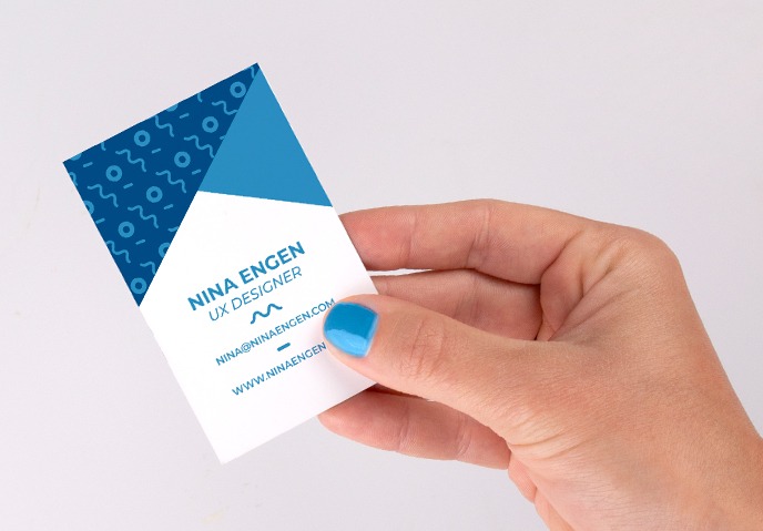
Blue is such a versatile shade that you can use it in almost any way. Classic Blue is a deeper, more mellow shade of blue, reminiscent of the deep sea or the sky at dusk. Perfect for adding a cooler elegance to print and for standing out against lighter contrasts.
Go bold and use it as a block colour in your design or as the main colour in your palette. If you’re adding accents or typography, just remember to have them in a bright, light colour so they don’t get lost in the rich dark blue.
This is where Foil can really shine (pun only slightly intended). As a darker colour, foils like silver and gold will really pop, perfect for adding a more luxurious finish to your designs.
Patterns and Gradients
Don’t feel you have to limit yourself to just one shade! As Classic Blue is a darker colour, it makes a great starting point for a gradient pattern. Gradients are already proving popular in wedding print, why not see for yourself how it can add class to your own designs?
Patterns are a great way to try the colour without committing to going fully blue. Patterns for wedding print was a big trend in 2019 and it doesn’t look like they’re going anywhere in 2020. Why not get doubly on-trend?
Add an accent
The colour of the year can also work wonders as an accent shade. You can capture the beauty of a clear night by mixing in golds and blacks or add a fun pop to lighter designs with a splash of Classic Blue in the corner or in your typography.
Since it’s so bold it’ll stand out in most designs, but is still chill enough that it won’t overpower the rest of the colour palette.
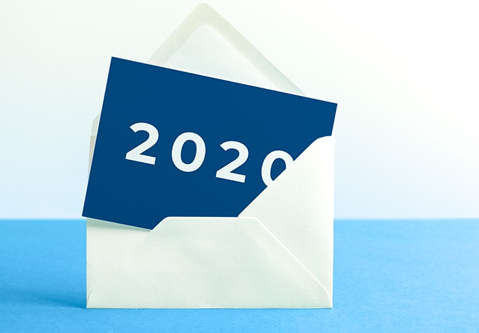
Ready to bring the colour of the year to life? From Business Cards to Flyers, Invitations to Calendars, we’ve got all your print needs sorted.
About the author
Our in-house designer Becca has a love of all things creative. When she’s not designing, you can find her in Newcastle checking out independent coffee shops or getting her hands dirty with her house renovation.