Tips and Advice
3 top tips for perfect Personalised print
When it comes to personalised print, we like to think we know our stuff. From Wedding Place Cards, to corporate documentation – getting those personal details right is absolutely crucial to the end result.
We’ll be 100% honest with you, it’s an area that our customers don’t always (quite) get right – so we’re here to help change that. So if you’re in any doubt that your personalised masterpiece isn’t ready to print, we encourage you to follow the below 3 steps before you hit that send button!
But before we dive in to the detail, it’s important to remind you about the TWO very important files you need to share with us when ordering anything personalised:
- A PDF of your artwork with [Personalise here] text
- A CSV file of names, or other variables you want on each print
Without these documents, your personalised prints will be going nowhere.
Now we’ve covered the basics, here are our 3 top art-working tips to make sure your print goes to press without a hitch.
1. Avoid outlining fonts
When preparing your artwork using software such as Adobe – it’s important to make sure you avoid outlining any fonts that you’re using. If you do this, it means that we can’t detect which fonts you have used. This will mean that your job gets file issued and we have to get back in contact with you to resupply it (what a nightmare!).
So when you enter your [Personalise here] text in your chosen font – don’t outline it! Just leave it be and we’ll do the rest. Simple.
2. Check your CSV file for errors
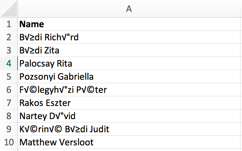
Example of CSV text errors
When it comes to exporting your CSV file, a number of characters and symbols can cause errors in your final print. For example if you have an accent over a letter in a name, or a non-alphabetical symbol, this character can show up differently when you export your file. So tip top number two is to make sure you thoroughly check through your file for any rogue characters or missing capital letters before you send it over to us, and remove/change these as needed.
And don’t think that by being either a Microsoft guru or Mac champion that you can avoid this. Both softwares can have this issue, so let’s eliminate the risk and check our files. It really does save us (and you!) a lot of time.
3. Avoid flattening artwork
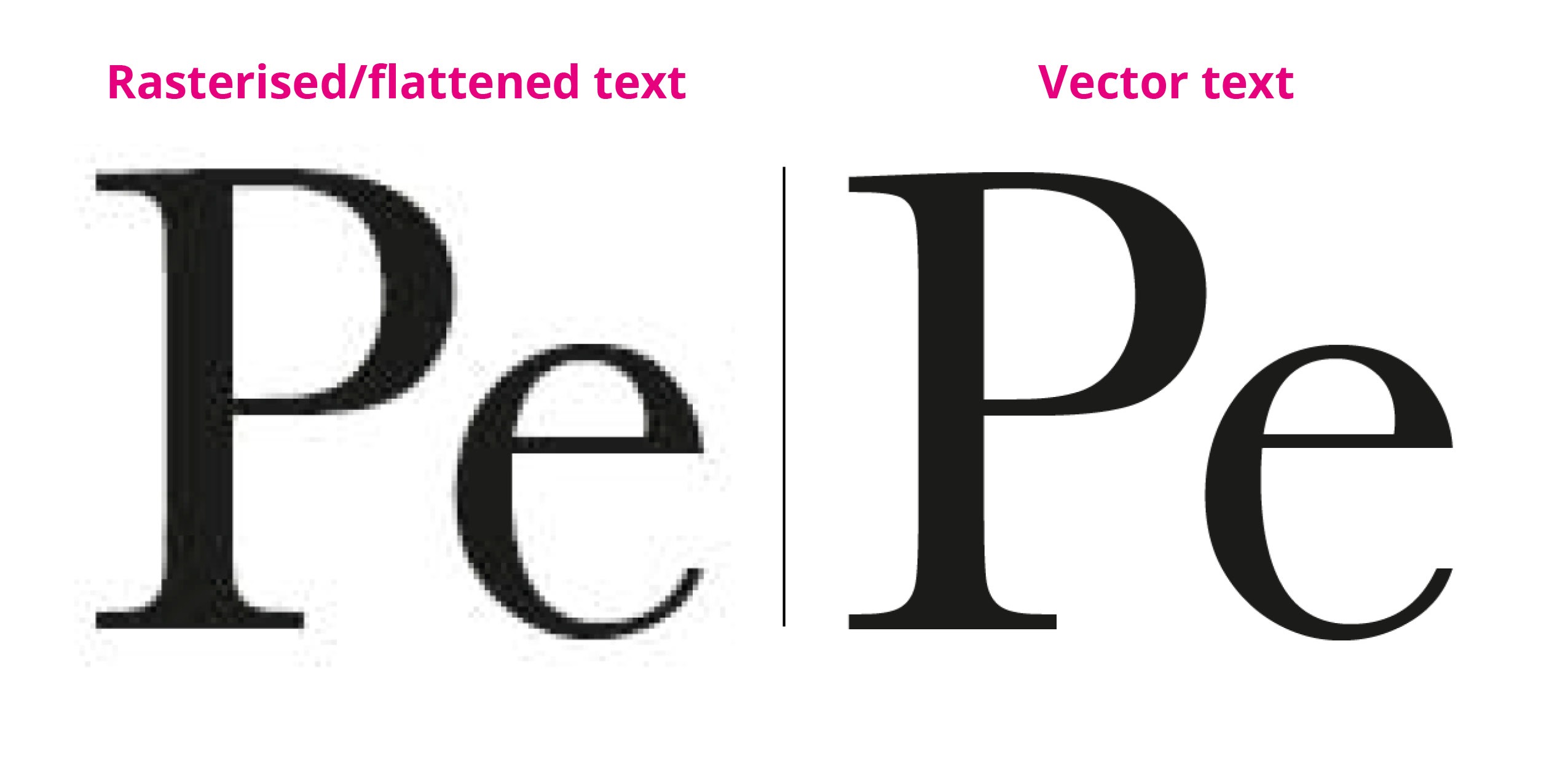
Example of flattened text issues
Our final top tip, but a VERY important one, is to make sure the artwork you send over is in sharp vector format. If you flatten your document (including any personalised text), it means we can’t access the necessary artwork information to move forward with your print.
Flattening your artwork also impacts the quality and resolution of your final print (which nobody wants do they?). So in summary, vector is paramount to making sure your print comes of the press looking sharp.
And those are our top tips! Personalised printing? You’ve nailed it.
If you’re still struggling with the above steps, don’t forget that you can always choose to upload a multi-page PDF of your personalised print document as a plan B. Just make sure to check everything thoroughly, and do give us a call or email if you have any questions.
Preparing artwork for print can be a little daunting (even for experienced designers). But being the helpful bunch we are, we’ve put together a series of Adobe tutorials so you can discover even more helpful tips. Enjoy!
About the author
Meet Drew! As part of the Printed.com marketing team, Drew spends her days crafting content. When she’s not working her magic on marketing, you’ll find her enjoying quality time with her daughter and her furry friend, Archie.