News
Using the latest colour trends to drive your success
We joined the experts with a finger firmly on the design pulse at the exclusive Trendtalks at Top Drawer 2019, to discover what’s hot and what’s not in the season ahead, and more importantly, what that means for you and your business.
Join us for a roundup from expert panel:
Nicola Snell, Founder – Press Loft
Sarah Davies, Interior and Retail Designer – Floella Creative
Trend planning is usually undertaken 12 months in advance – but don’t worry if this is the first you’re hearing about trends for 2018 and 19!
Whilst colour trends dominate and dictate a lot of press and PR, staying true to your brand, values and core identity is key, over and above following trends.
If you’re thinking in advance, we’ve outlined the big trends to keep an eye on towards the end of this post, but for now, we’re taking a look at what’s hot right now, what’s coming, and how you can use colour trend sin your own projects and collections.
First up, where can you find trend inspiration?
Fashion and interior design are great places to start. Every year Pantone releases its colour of the year, and this seeps into our fashion trends. Plus, Dulux and PGM also release colours of the year – Spiced Honey and Night’s Watch, respectively. These were announced at the end of summer/autumn last year, and its likely they’ll release the same for 2020 at a similar time this year – so if you want to get ahead, here’s where to start!
When it comes to trends and colours though, you need to keep your customer front of mind, whilst keeping your trends fresh and relevant.
Overall, you need a balance between what makes you, you, and what’s new and upcoming.
For 2019:
Washed out shades are in for 2019 – pastels but in muted tones. These are easily accessible and can be incorporated into almost any design, making 2019 the ideal year to start using colour trends in your own designs.
Havana (Cuba’s seventh oldest city) also has their 500th anniversary in (November), so expect tropical trends, carnival colours and botanical prints to be landing in late summer.
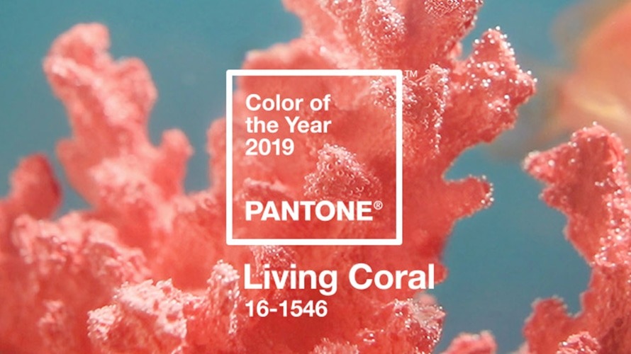
Let’s talk Living Coral
Pantone’s Colour of The Year has landed with a bang, and it’s everywhere! The Press are lapping up this bold shade, and you should be too!
Not only is it cheery, bright and bold, it can be toned down and muted to suit a variety of projects.
Ultraviolet (the colour of the year in 2018) wasn’t as accessible to everyone – not many people would paint a living room in vibrant purple, for example, which is why you’re more likely to see Living Coral taking over.
Living Coral also teams well with Spiced Honey (Dulux’s colour of the year) plus all of the muted pastel shades that are set to be big in 2019 too.
Is Living Coral influenced by other trends?
Makers, creators and trend leaders are focusing on being sustainable and recyclable and eco-friendly more and more as we move in 2019. Living Coral itself feels like a recycled trend, with a 70’s influenced vibe, which pairs nicely with the plethora of mustard shades, deep greens and botanical prints which are dominating the fashion scene – reminiscent of a 70s living room.
Living Coral also lends itself to transitioning through seasons, with a plethora of shades available for designers to use, no matter what the season.
Key opportunities for brands:
Any journalist wants to write about the latest trends and latest news – colours are easy for them to write about. If you utilise colour trends (and use a tool like PressLoft – which you can find out more about here) it’s easy and simple for journalists to feature your work.
If the trend of the year (or season) isn’t for you, a useful way to gain traction is through recognising the trend and building alternative options – think: Pinterest boards, colour collections or even just highlighting the trend through other mediums and sharing it.
You can then piggyback off of other hashtags and @responses to get a conversation started and appear online ins searches etc.
In retail, you need to be seasons ahead. How can designers and retailers take advantage of the seasonal cycle?
A highlighted trend for 2020 and beyond is ‘Neomint’ – so you could get ahead of the curve and create pieces which are adaptive and inclusive to colour trends. Plus, if you’re using colours ahead of time, you’ll be able to put together some great creations and upload them to sites like PressLoft before everyone catches on, giving you more of a chance to get your work featured in editorials. Read about why this minty shade is set to be big news in 2020.
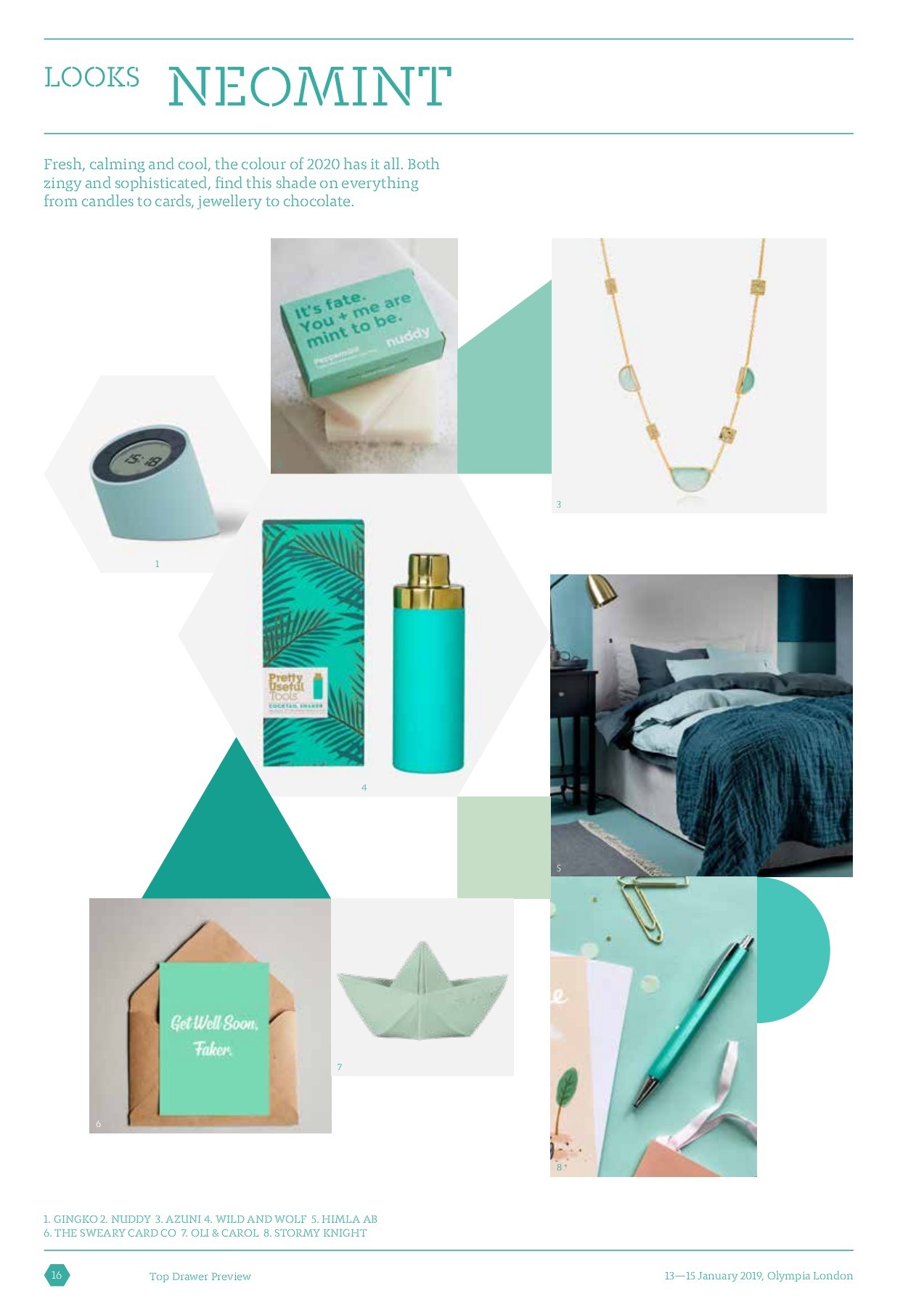
Neomint on display in the Top Drawer 2019 magazine
Some key colours that come through every year include:
Spring pastels – yellows and greens
Summer – bright bold summery colours
Autumn – mustards browns, oranges
Winter – darker shades
Christmas – metallic shades
This means that you don’t need to add anything new, or update your work, just simply add a spin on it when promoting your current collections, and get them together ahead of time.
It’s also worth thinking about how you can adapt your current colourways and change the tones to suit the seasons.
Collaborations and their role in trend building
A good way to branch out and expand your brand is through collaborations. Collaboration with a retailer or another designer offer amazing possibilities, and are a great way to expand your networks and customer database.
Brand collaboration adds depth to your designs and It also gives you a story to tell with your brand. It’s a fantastic way to create an interesting story, and there are so many different ways to cross promote and build content around your collaboration.
If you’re thinking about a collaboration, read this first! It’s got loads of tips on how to get started, who’s doing it well and how you can make it work for you.
If you’re still not sure, take a look at our Interview with Ted & Kip, Business Booster winner from 2018, and see how collaborating with Mint Cake Club helped their business.
Remember, The more people that hear about your brand and align your brand with another established brand is a winner for smaller businesses.
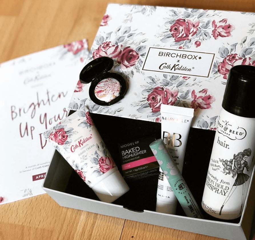
Cath Kiston x Birchbox Collaboration
In summary, when it comes to trends:
- Remember that colour trends CAN be mixed
- Think about how you progress into each season with your shades
- Keep true to your brand and values, and don’t blindly follow a trend if it’s not in your style
- Consider collaborations with others to create on-tend content
- Get set for trends nice and early and get your collections into places like PressLoft.
About the author
When she’s not perusing the factory or planning our next product launch, you’ll find Emma doing some form of exercise. Whether it’s her favourite gym class or a walk around Northumberland with friends, she loves keeping fit!