Inspiration, Wedding
2026 Colour Trends: Wedding & Print Inspiration for the Year Ahead
When it comes to predicting what’s next in the world of design, few platforms have their finger on the pulse quite like Pinterest. Their annual trend reports are legendary for spotting shifts before they happen, and the Pinterest 2026 colour trends are no exception.
For wedding stationers, designers, and couples currently planning their big day, consider this blog your ultimate tool. This year’s colour trends signal a move away from the safe, muted neutrals we’ve seen in recent years towards something far more expressive. We’re talking about a palette that feels grounded yet optimistic – perfect for setting the tone of a wedding or a new print collection.
Whether you are a bride-to-be building your mood board or a reseller looking to refresh your product range, let’s explore how these five key colours can transform your next print project.
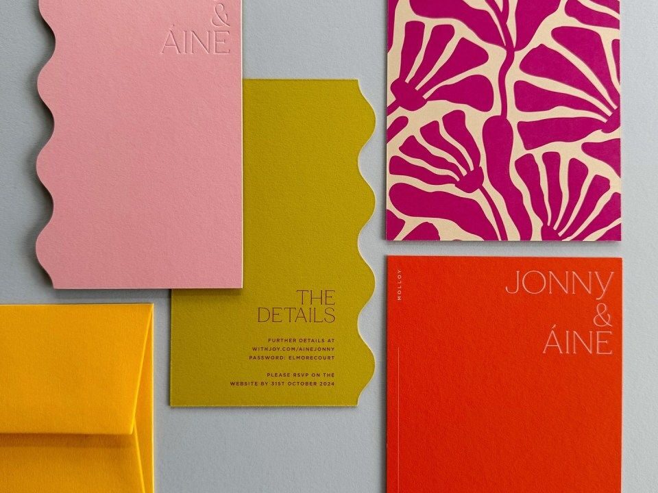
Table of Contents
The Pinterest 2026 Colour Palette
How to Use the 2026 Colours in Wedding Stationery
Colour Pairing & Styling Inspiration
The Pinterest 2026 Colour Palette
This year’s forecast is all about balance. It blends the natural world with digital vibrancy, offering a mix of soothing tones and energetic pops of colour. Here are the five shades defining 2026:
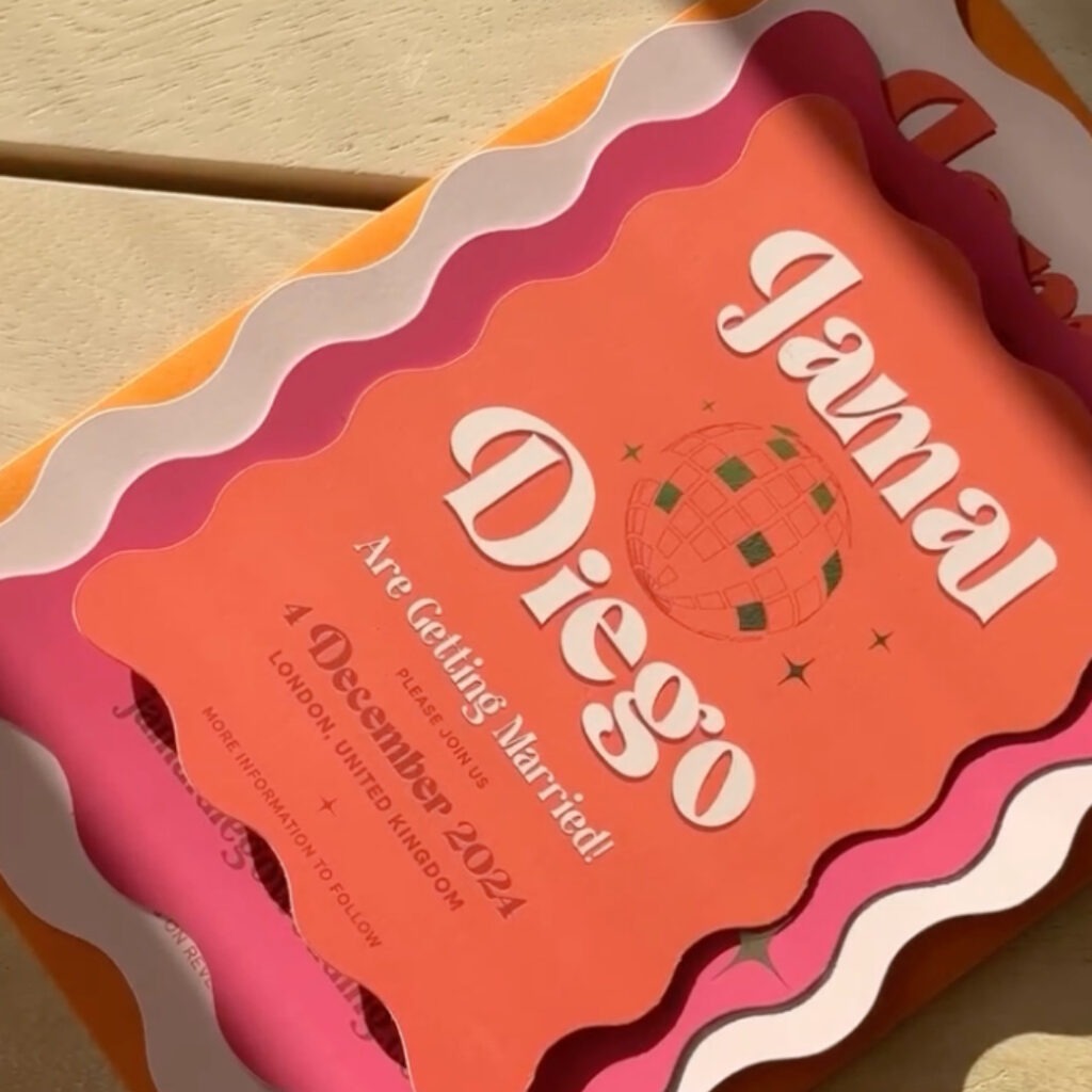
Persimmon
Warm, bold, and undeniably expressive, Persimmon is the standout star. It’s an evolution of terracotta but with more punch. It feels sun-baked and inviting, making it perfect for summer and autumn weddings where you want to inject energy without using primary red.
Jade
Moving away from the sage greens that have dominated wedding stationery colour trends for the last few years, Jade offers something deeper and more luxurious. It is calming and nature-led but has a gemstone quality that feels sophisticated and expensive.
Cool Blues
Think fresh air and clear skies. Cool Blue is modern and timeless, acting as a fantastic palette cleanser. It’s crisp enough for modern typography-led designs but soft enough to work in romantic, watercolour-style invites.
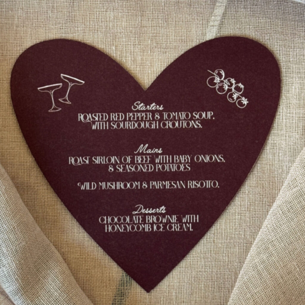
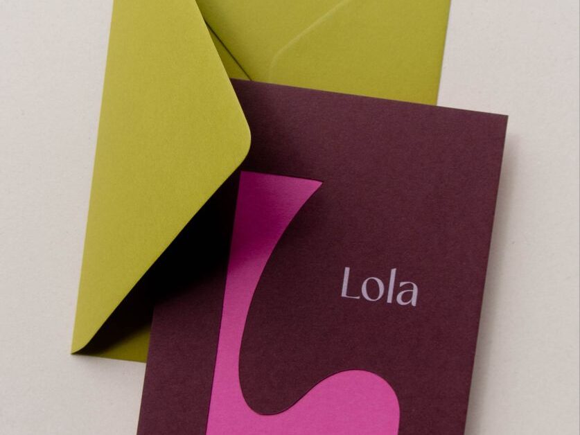
Plum Noir
Deep, moody, and elegant, Plum Noir brings the drama. It’s the anchor of the palette—a rich, dark alternative to black or navy. It screams luxury and pairs beautifully with metallic finishes.
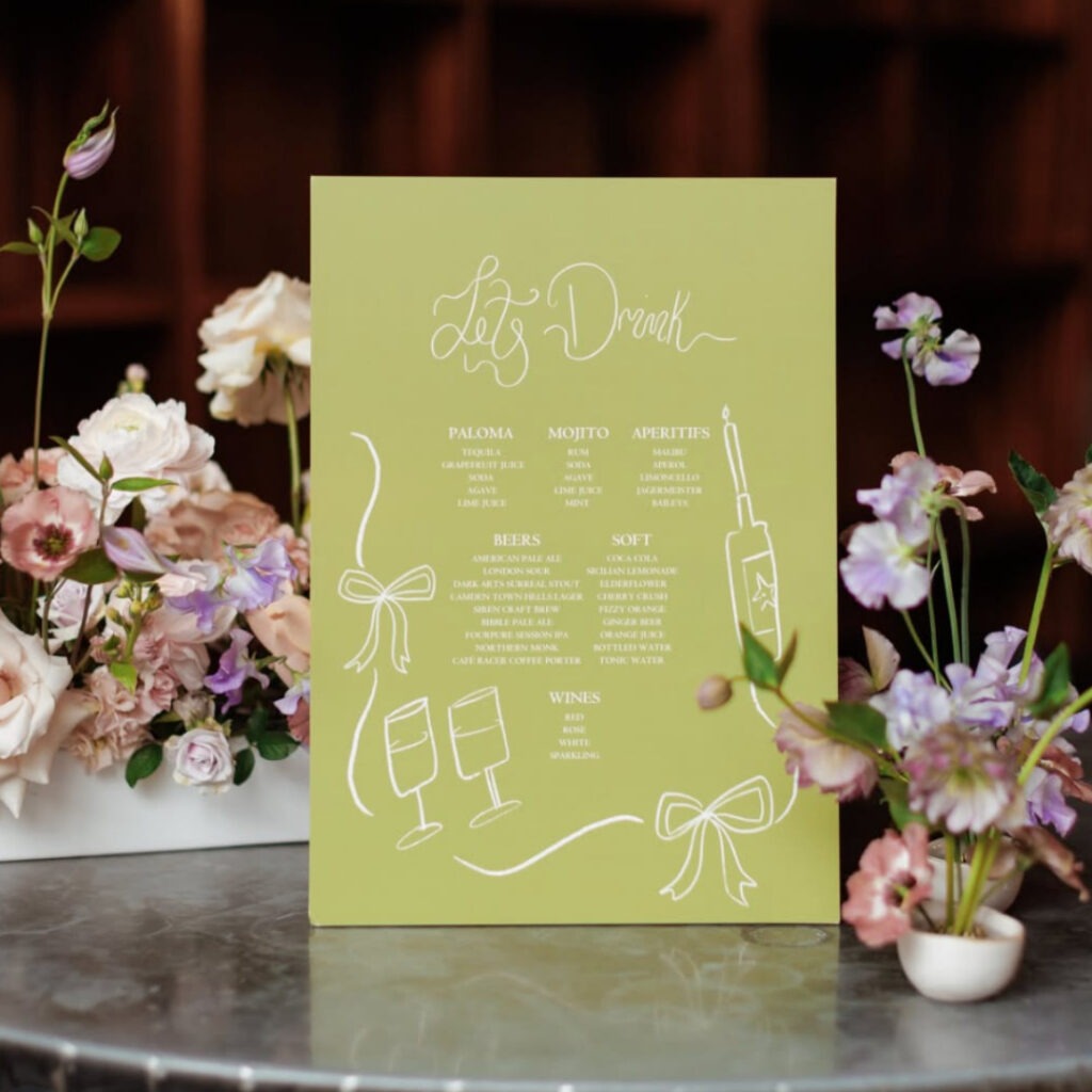
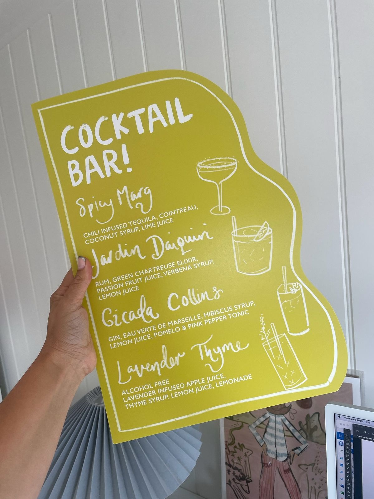
Wasabi
This is the wildcard. Wasabi is a vibrant, playful green-yellow that feels zesty and unexpected. It’s for the bold couples and the brands that want to disrupt the status quo. It adds a “zing” to an otherwise safe colour scheme.
How to Use the 2026 Colours in Wedding Stationery
So, how do you translate these digital trends into physical print? The beauty of wedding print inspiration lies in the details. You don’t need to drench everything in one colour; it’s often about how you layer them.
Save the Dates
Persimmon or Wasabi are perfect for Save the Dates because they grab attention immediately when they land on a doormat. A bold envelope liner in these shades can set the scene before the card is even pulled out.
Invitations
For the main event, Jade and Plum Noir offer a sophisticated backdrop for your Invitations. Consider using white ink printing on deep plum cardstock for a high-end, evening-wear feel. Alternatively, a heavy cotton paper with Cool Blue embossed details creates a classic, tactile experience – available through our Bespoke Service!
On-the-Day Stationery
This is where you can have fun with wedding design ideas.
- Menus: Use Wasabi as a pop of colour for the belly band or the napkin ribbon.
- Signage: Persimmon works beautifully for large-format welcome signs, especially when paired with natural wood textures or copper stands.
- Place Cards: Try a tint of Cool Blue for a subtle, airy look on your tablescape.
Finishes and Materials
To really make these colours sing, think about texture. Plum Noir looks incredible with gold hot foil stamping. Jade comes to life on textured papers like Tintoretto Gesso, enhancing that natural, organic feel.
Colour Pairing & Styling Inspiration
One of the hardest parts of design is knowing what goes with what. Here is how we recommend mixing the 2026 palette:
- The “Sunset” Mix (Persimmon + Plum Noir): This is ideal for late summer or autumn weddings. The depth of the plum grounds the brightness of the persimmon. It feels warm, romantic, and slightly vintage.
- The “Fresh” Mix (Cool Blue + Wasabi): Modern, zesty, and perfect for spring. This combination feels very high-fashion and youthful. It works well with minimalist typography and plenty of white space.
- The “Luxe Nature” Mix (Jade + Neutrals): If you aren’t ready to let go of neutrals, pair Jade with warm creams and stone shades. It keeps the look grounded but adds that trend-led richness.
For stationers, creating mood boards that show these pairings can help clients visualise how bespoke wedding invites could look beyond the standard white and gold.
Tips for Brides & Grooms
If you’ve fallen in love with these trends, it’s easy to get carried away. But remember, trends should serve your style, not dictate it.
- Don’t be too literal: You don’t need to use the exact Pantone match for Persimmon. Use it as a guide. Maybe it appears in the floral arrangements and the ink on your invite, rather than the bridesmaids’ dresses.
- Personalise it: Use print to tie the day together. If you choose Cool Blue, carry that through from your invites to your order of service and even your Thank You cards. It creates a cohesive brand for your wedding.
- Ask for samples: Colours look different on screen than they do on paper. Always order a sample pack or printed proof to see how Wasabi looks on uncoated vs. silk paper.
Ready to Print Your Palette?
The 2026 palette is exciting because it feels versatile. whether you are planning a moody, romantic winter wedding with Plum Noir or a bright, zestful summer party with Wasabi, there is something here for everyone.
At Printed.com, we are ready to help you bring these colours to life. From our vast range of luxury paper stocks to Special Finishes like foiling and white ink, we have everything you need to make your wedding print inspiration a reality.
Explore our Wedding Collection pages for Wedding Stationers and Brides & Grooms today to get started, or get in touch with our team for advice on bespoke colour matching and custom print options.
About the author
Meet Tasmine, our Social Media & Content Manager! When she’s not busy creating content, she’s out on a run, enjoying iced coffee, or daydreaming about Daschunds.