Inspiration, Tips and Advice
Introducing Night Watch – 2019’s must-have colour
Interior design and paint trends might not be your first point of call when it comes to thinking about what’s coming in the world of stationery. But, just like fashion, the popular choices that dictate in areas like interior design and even right down to our outdoor spaces, these trends all play a part in the trends we employ when it comes to design.
With so many trends circulating, it can be difficult to know which ones to pick and which colours are going to be the real heavy hitters in the year ahead.
We already took a look at Pantone’s colour trend report, but now we’re looking at 2019’s ‘it’ colour – Night Watch.
Sticking with the intriguing, deep dark shades that set the tone for maximalist designs, PPG have nominated this intriguing green hue as their shade of the year.
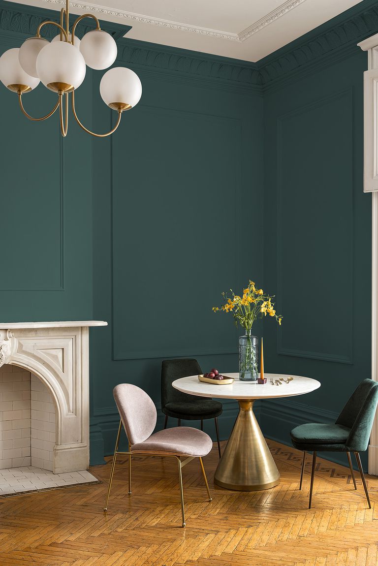
Image credit: PPG Paints
According to PPG Paints, the colour of 2019 is a deep hunter green that’s inspired by nature. “Night Watch is about bringing the healing power from the outdoors into your home through color,” said Dee Schlotter, PPG senior color marketing manager. “The dark green hue pulls our memories of natural environments to the surface to recreate the calming, invigorating euphoria we feel when in nature.”
So how should you be using it in your designs?
Whilst the shade has been selected for interiors, it’s easy to see how it will transcend across all areas of design. From retail to fashion, to homewares, we reckon this gorgeous green will be big news – everywhere.
When it comes to using this colour in your home, the advice is to use it sparingly – but the great thing about stationery is that whether you’re creating a Notebooks to a Greeting Card, or even a Business Cards or Presentation Folder – these small prints are designed to catch attention, so there’s no need to be sparing here. Plus, this deep luxurious shade looks great with Foiling, ideal for a luxe appeal with the wow factor.
One of our very own customers, Design By Emily, is already getting on board with the trend. Take a look at how she’s incorporated this gorgeous green shade into her wedding stationery suites!
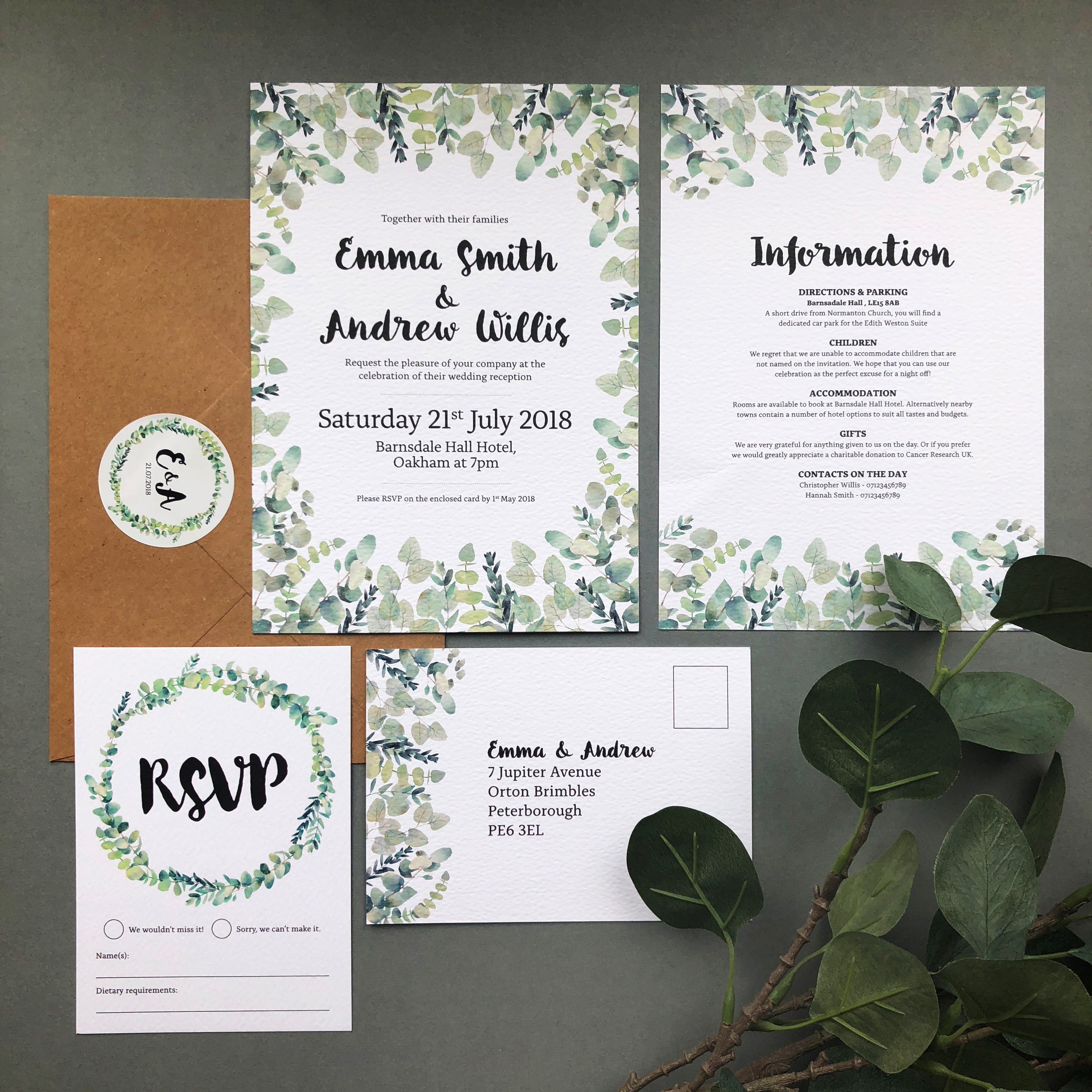
Image credit: Design by Emily
For a more subtle approach to this bold shade, pair it with lighter, softer greens and draw on the cool, complimentary sage hues that this shade pairs so well with. Lending itself extremely well to foliage led designs, we reckon this style is ideal for spring and summer weddings!
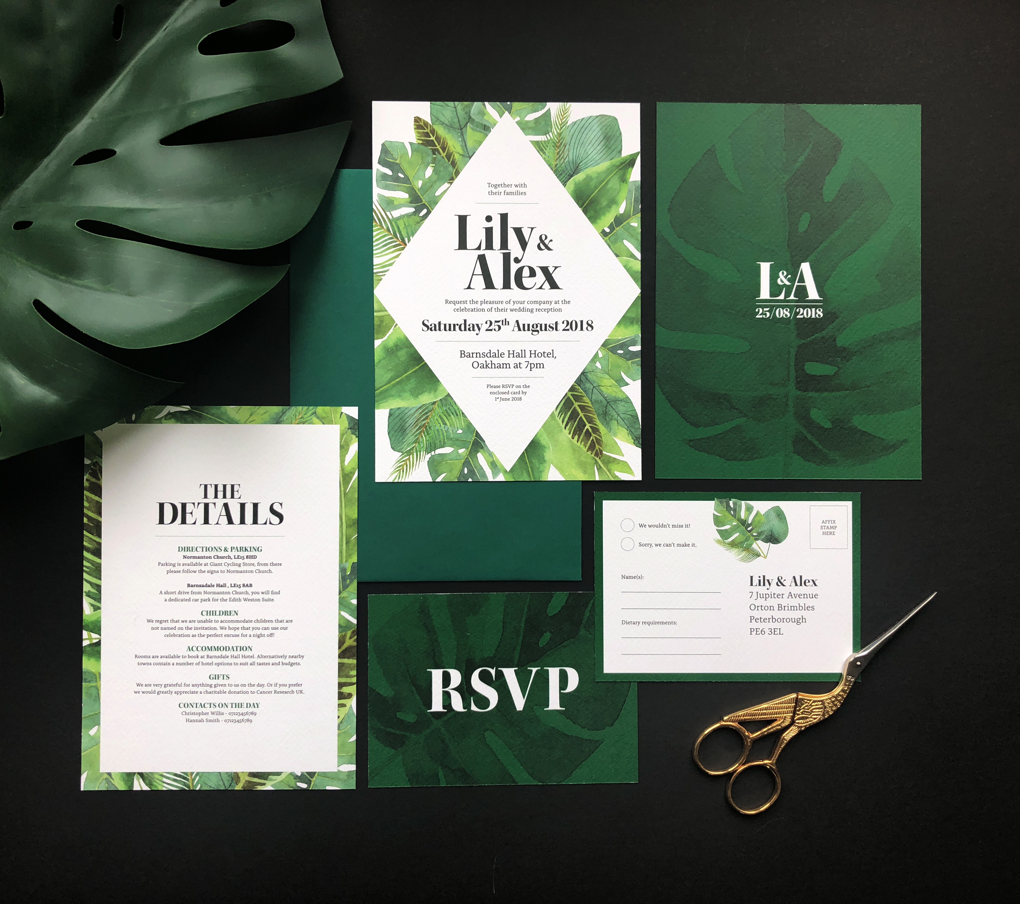
Image credit: Design by Emily
Showing us how to go deep and dark with this shade,Design By Emily have created this ultra luxurious suite using mysterious green shades for dramatic effect. We love how this suite is offset with the gold scissors, and we reckon that Gold Foiling would look fantastic with this intriguing shade, which, as luck would have it, Design By Emily have created too… get ready for some luxe foil envy!
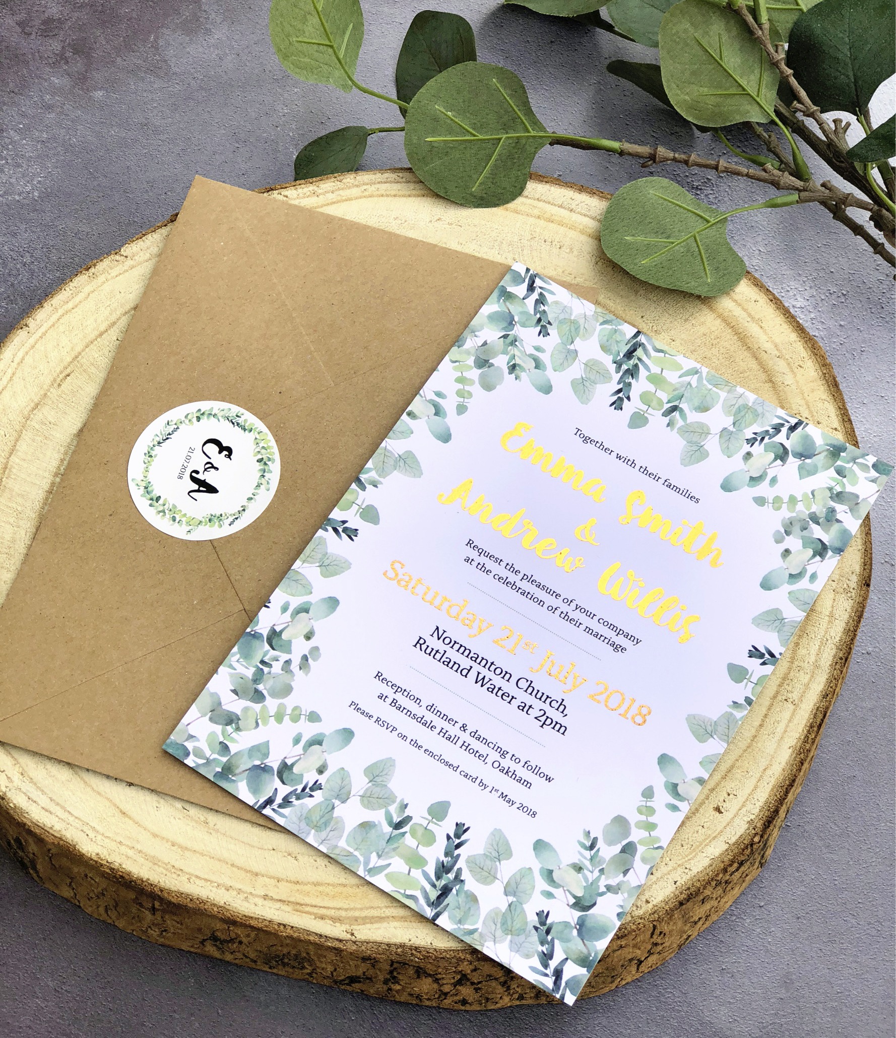
Image credit: Design by Emily
We asked Rachel, of Raspberry Flavoured Windows – (She’s an interior Decorator, content creator, social media consultant, furniture designer and finalist at the Amara IBAs, phew), what she thought of PPG’s nominated shade…
“With the explosion of maximalist design coupled with a definite change in direction from the paler dusky hues, jewelled colours are definitely making a comeback for 2019. As we transition into the cooler months Nights Watch is the perfect backdrop to show case richer colours in interiors. Layer it up with burnt orange, ruby red and sapphire blue, add texture with sumptuous velvets, and to give the whole scheme a lift throw in some pops of gold. At its heart this is a very traditional colour and I see it being used with a classic but modern approach in the design and stationery world. Think matt finishes with pops of gold or copper foiling with a nod towards Art Deco design. Mix it up with other jewelled colours to create maximalist botanical designs. Or use it against a stark white background for typography prints, it’s dark inky hue will lend an air of sophistication that even black can’t match.”
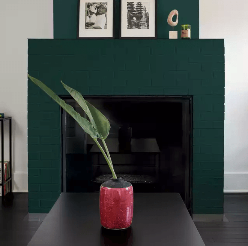
Image credit: Apartment Therapy
Ready to get designing? Shop everything at Printed.com and get creative!
About the author
Our in-house designer Becca has a love of all things creative. When she’s not designing, you can find her in Newcastle checking out independent coffee shops or getting her hands dirty with her house renovation.