Business, Inspiration
10 Unique Business Card Design Ideas That Stand Out in 2026
The most striking Business Cards in 2026 combine tactile finishes with thoughtful design, think metallic foil, embossing, die cut shapes, spot UV and multisensory textures. The best choice depends on your industry and the impression you want to leave. We’ve seen creative brands lean into bold gradients, while consultants switching to favour minimalist black and white designs.
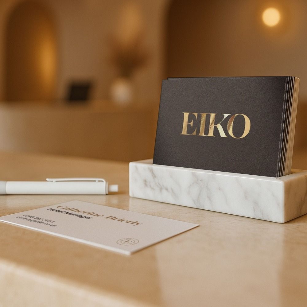
A Business Card still does something a LinkedIn profile can’t. It lands in someone’s hand, and for a few seconds, it becomes the whole of your brand. That moment matters. Get it right, and people remember you long after the conversation ends.
The good news? You’ve got more ways than ever to make that moment count. Below, we’ve gathered ten design ideas that feel fresh for 2026, along with a note on the type of business each one suits best. Not every option will be right for you and honestly, that’s the point. Your card should reflect who you are and the impression you want to leave behind.
Let’s get into it.
1. Metallic Foil Business Cards
Digital foiling is our standard foiling method and it’s easy to see why. It adds a metallic shine quickly and cost effectively, without the need for traditional tooling. The foil sits on top of velvet lamination, giving you a smooth, luxurious finish that’s flush with the paper surface.
Smooth stocks like silk produce the sharpest, most reflective results, which is why we only offer foil on Silk, Recycled Silk and Uncoated paper stocks as standard.
In 2026, softer tones are leading the way. Champagne golds, brushed copper and soft white pearl tones are replacing the high-shine finishes of previous years. Used sparingly, these metallics lift a minimalist design and signal quality without overwhelming it.
Best for: Property professionals, design agencies, beauty specialists, event planners and consultants. If your first impression needs to communicate luxury and precision before you’ve said a word, foil does the talking.
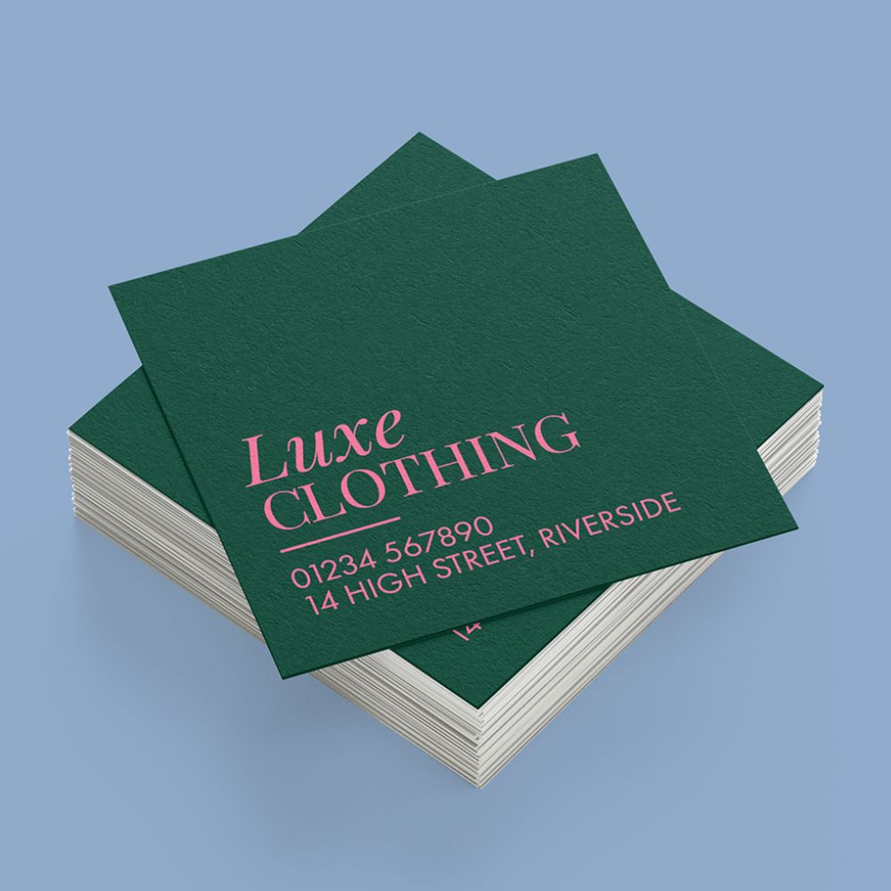
Square Business Cards
The symmetry of a square format changes how people interact with your design. There’s no default landscape or portrait orientation, so the card feels intentional the moment someone picks it up. The equal-sided canvas also suits logos, icons and images that rectangular cards struggle to display well. Just keep text in mind, designs with lots of wording work best on broader shapes, while long, thin or tapering shapes can make copy harder to read.
A square card simply feels different in the hand before anyone reads it. That subtle signal of creativity is exactly why these formats appeal to a particular kind of brand.
Best for: Designers, studios and creative entrepreneurs. Square Business Cards aren’t for everyone, which makes them more effective when used the right way.
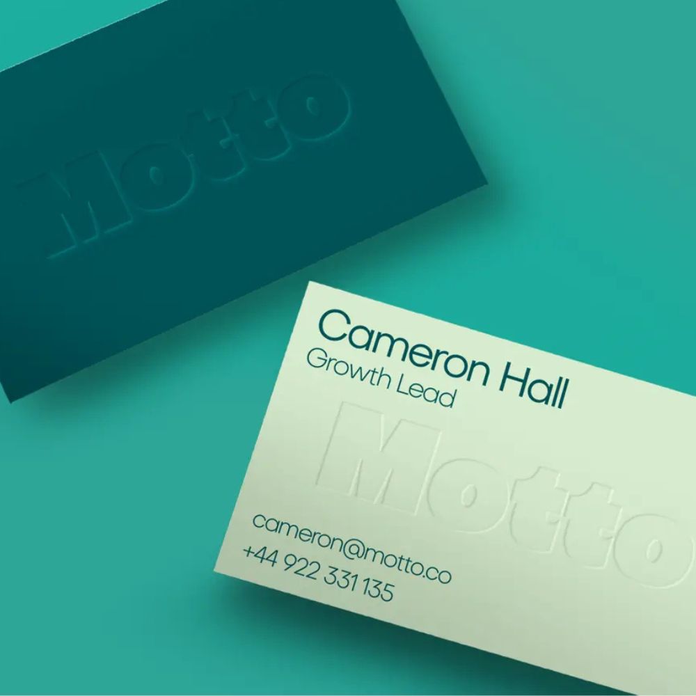
3. Embossed and debossed Business Cards
Embossing creates a raised effect, pressing your design up from the paper using a custom metal die. Debossing does the opposite, pressing the design down into the paper to create a sunken impression. Both add texture and depth that people feel before they look.
Embossing brings a sense of elegance and exclusivity, it catches the eye and invites attention. Debossing offers a more understated charm that pairs beautifully with minimalist or vintage aesthetics, tempting recipients to run their fingers over the design.
Best for: Wedding stationers and wedding suppliers like florists and illustrators. A tactile finish increases perceived value, improves memorability and conveys the kind of craft and professional credibility these brands rely on.
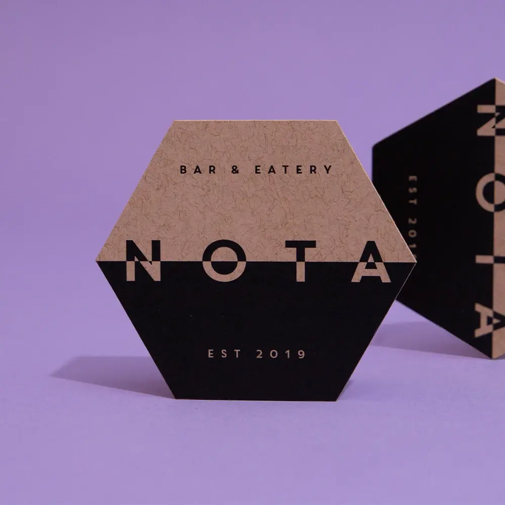
4. Die Cut Business Cards
Die cutting turns a standard rectangle into a shape that says what you do straight away. A bottle or glass silhouette suits wineries and drinks brands. A house or key outline works for estate agents. Photographers can use a camera or aperture circle, scissors suit hairdressers and leaf shapes resonate with wellness, nutrition or eco brands.
Over time, that custom shape becomes part of your brand identity. People recognise it and associate it with you, no copy required. A fitness company with a dumbbell shape or a tech firm with a circuit-board outline reinforces its personality through physical form alone.
Best for: Almost any industry, thanks to the flexibility of the technique. Here’s a quick test: could a stranger guess your industry from the silhouette alone? If yes, go for it. If not, a premium finish on a clean square card might serve you better.
5. Gradient colour palette Business Cards
Gradients are back from the 90s with renewed energy. Neon gradients grab attention through vibrant colour and suit creative fields like art, fashion and media. Single tones that fade into white or black, paired with bold modern fonts, create a futuristic feel. Blue, purple, and pink hues work beautifully for brands tied to spirituality or cosmic themes.
One clever advantage: a gradient can give each recipient a slightly different version of your card while keeping your branding consistent. That subtle variety shows off your range as a creative professional.
Best for: Creative professionals and brands with high-contrast gradient branding. Here, the gradient becomes the central design element, communicating creativity without crowding out your contact details.
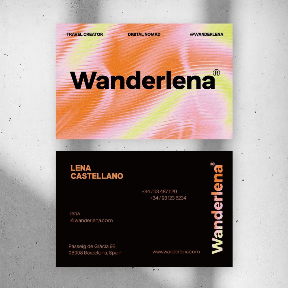
Image Credit – UntitledStudioKR
6. Spot UV Business Cards
Spot UV applies a clear, UV-cured varnish to specific areas of your design rather than the whole surface. Those glossy areas catch the light as you tilt the card, drawing the eye exactly where you want it. The effect relies on contrast, shiny against uncoated paper, so recipients notice it right away.
Coverage is key. For maximum impact, keep spot UV to no more than 25% of your design. Dark backgrounds produce the most striking results: black cards with glossy spot UV elements create stunning contrast and black-on-black designs make images pop even on uncoated stocks. Logos are the most popular choice, as the gloss lifts perceived quality on matte backgrounds, with names and company names a close second.
Best for: B2B businesses wanting a touch of shine. Engineering firms and manufacturers, in particular, can use this finish to make an otherwise simple design stand out.
7. Minimalist black and white Business Cards
Black and white remains the most pared-back colour combination you can choose, and it’s a classic for good reason. But minimalism doesn’t mean playing it safe.
A well-arranged, simple design tells people your company knows exactly what it’s doing and that everything sits in its proper place. There’s no clutter and nothing over the top, just your message, delivered clearly. Clients often assume a smooth, clean experience will follow when they see that same clarity in your card.
Best for: Design studios, consultants, architects and luxury brands. Minimalism works best when your brand identity is clear, your message is simple and your material quality is high. Black cards with white text, subtle foil accents, or a blind deboss on black stock create strong contrast with very few elements.
8. Collectable series Business Cards
For years, the LEGO Group handed out custom LEGO minifigure replicas of its employees as Business Cards, tiny plastic executives with the staff members name on the front and contact details on the back. The result? A networking tool people wanted to display rather than file away.
Collectable cards are one of the most playful trends for 2026. Inspired by trading cards and sports memorabilia, these designs lean into our natural love of collecting, turning cards into keepsakes worth keeping, swapping and showing off. To try it, design cards in unusual shapes, as part of a themed series, or styled like mini art prints.
Best for: Brands with personality and a sense of fun, think creative agencies, entertainment and consumer brands that want their card to live on a shelf rather than in a drawer.
Image Credit – Behance
9. Blueprint Business Cards
The blueprint business card trend draws inspiration from architecture and engineering to create a look that conveys planning, precision and innovation.
These designs often feature grid layouts, schematic line drawings and deep blue palettes with white accents, mirroring traditional architectural blueprints. You can bring the concept to life by including detailed drawings that highlight your product or service.
Best for: Architects, engineers and tech innovators. If your work is built on precision and technical skill, a blueprint card communicates exactly that the moment it’s handed over.
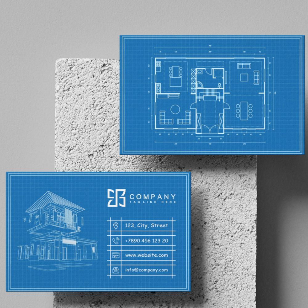
Image Credit: Upwork
10. Multisensory textured Business Cards
Touch triggers memory differently from sight alone. When someone picks up a card with unusual weight or a soft, velvety surface, their brain pays attention in a different way. Cotton Paper pairs eco-conscious design with luxury, made from recycled cotton linters, it offers a soft, textured, biodegradable feel. Lux delivers a triple-layered, soft-touch finish, while Fresco Gesso and Tintoretto Gesso offer subtly different hammered textures.
Multisensory effects do real work for your brand. Your name becomes tied to a feeling, not just a font and a thoughtfully crafted card becomes a small, ongoing reminder that digital touchpoints simply can’t replicate.
Best for: Luxury brands, boutique studios and eco-conscious businesses. Anywhere a premium, tactile experience reinforces what you stand for, texture earns its place.
Choosing the right card for your brand
There you have it, ten distinct ways to take your networking tool from forgettable to remarkable while staying on trend in 2026. Not every option suits every business, and that’s exactly how it should be. The best card is the one that reflects your brand personality and the impression you want to leave behind.
If you’re weighing up a few ideas, start with your industry and your audience. A luxury consultant and a neon-bright fashion studio need very different things from a card. From there, think about budget and the single feeling you want someone to walk away with be it precision, creativity, craft or care.
Ready to bring your idea to life? Explore our range of special finishes and paper stocks and create a card people will actually want to keep.
Frequently asked questions
What is the most popular Business Card finish in 2026?
Metallic foil in softer tones brushed copper, white pearl and champagne gold foil is among the most popular finishes in 2026. These muted metallics lift minimalist designs and signal quality without the high-shine look of previous years.
How do I choose the right Business Card design for my industry?
Start with the impression you want to leave and the way your audience judges quality. Luxury and presentation-led fields like property, beauty and consultancy suit foil and embossing, while creative studios lean towards square shapes, gradients and collectable designs. A good test for die cut cards: if a stranger could guess your industry from the silhouette alone, it’s a strong choice.
What is spot UV and how much should I use?
Spot UV is a clear, UV-cured varnish applied to specific areas of your design to create glossy highlights against a matte background. For the best effect, keep coverage to no more than 25% of your card and use dark backgrounds, black-on-black designs are especially striking.
Are textured Business Cards worth the extra cost?
For brands where a premium feel matters, yes. Textured stocks like cotton paper or soft-touch finishes create a sensory experience that people remember and associate with your brand. This makes them well suited to luxury, boutique and eco-conscious businesses.
What’s the difference between embossing and debossing?
Embossing raises your design up from the paper’s surface for an elegant, eye-catching effect. Debossing presses the design down into the paper for a subtle, understated look that pairs well with minimalist or vintage aesthetics. Both add tactile depth that people feel before they read.
About the author
Meet Drew! As part of the Printed.com marketing team, Drew spends her days crafting content. When she’s not working her magic on marketing, you’ll find her enjoying quality time with her daughter and her furry friend, Archie.