Inspiration, News
The 2022 Pantone Colour of the Year
It’s like Christmas day again for colour lovers everywhere.
While many of us spent the final days of 2021 reflecting on its whirlwind events, Pantone was busy looking ahead to decide on the shade that will best encapsulate 2022.
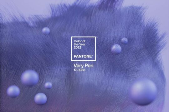
The Pantone Colour of the Year has been announced as Very Peri. Don’t get too excited, it’s got absolutely nothing to do with Nandos. The colour is actually described as a “dynamic periwinkle blue hue with a vivifying violet red undertone”.
The announcement of the Colour of the Year is always a dramatic time in the creative world. For the last 22 years, each chosen shade has had a huge influence across all aspects of design, including fashion, film and of course, print.
Why was Very Peri chosen?
Interestingly this colour selection has made Pantone history. Instead of choosing a winner from its leading seasonal hues, the colour specialists have gone off the grid to create a brand new shade for 2022.
Marking new beginnings, the complexity of Very Peri highlights the new and exciting possibilities that lie before us.
Very Peri can be found in nature, as seen in periwinkle flowers, exotic birds and butterflies but also in the digital space. From NFTs to Mark Zuckerberg’s promise of the Metaverse (we’re still trying to wrap our heads around this one), it represents the blurring boundaries between offline and online.
Pantone stated, “As we emerge from an intense period of isolation, our physical and digital lives have merged in new ways. Very Peri illustrates how colour trends in the digital world are being manifested in the physical world and vice versa.”
Using the Colour of the Year in print
Being well-suited to an array of textures and finishes, this warm and whimsical shade is the perfect colour to incorporate into your printed designs.
Pair it with a textured papers like Fresco Gesso for Greeting Cards and Hahnemühle German Etching for Fine Art Prints, or bring it to life with a pop of contrasting Foiling. The design possibilities are endless!
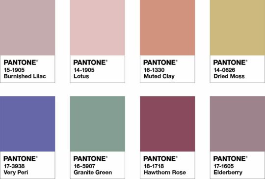
Dried Moss? Muted Clay? Ever wish you had a job naming colours? The team at Pantone are very good at it.
The bold shade may seem like a difficult hue to work with, but Very Peri pairs nicely with an array of colours, and Pantone have helped you out by bringing you four unique palettes. So challenge yourself to think outside of your usual habits and incorporate these colours in your next printed project.
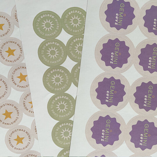
From Round Stickers to promotional Postcards, here’s how some of our customers are already using purple hues.
Gemini Cove
Whether they’re on or in your brand packaging, Stickers are often the first thing your customer will interact with. Make yours stand out with colour like Gemini Cove!
CakeDrop
It was like CakeDrop could predict the future as their brand colours are nearly identical to Very Peri. They’ve used a pop of purple to jazz up their Postcards in this delicious treat box.
(First it was Nandos, and now it’s biscuits. Sorry for making you hungry)

The Draw Store
Name a better duo than Very Peri and textured paper? Us and The Draw Store will wait. Textured paper is generally better for lighter colours, making this a great pairing!

Setting up your colour
While we don’t print Pantone, you can still print this stunning shade using other colour values. Check out our approximations below:
- RGB: 102, 103, 171
- HEX/HTML: #6667AB
- CMYK (approximation): 40, 40, 0, 33
Now it’s over to you to get creative. Make sure to tag us using the hashtag #ProudlyPrinted on Instagram and show us all your amazing Very Peri Creations!
About the author
Meet Drew! As part of the Printed.com marketing team, Drew spends her days crafting content. When she’s not working her magic on marketing, you’ll find her enjoying quality time with her daughter and her furry friend, Archie.