News
RGB vs CMYK: What is the difference?
What is the difference between RGB vs CMYK?
Whether you’re crafting a Flyer for your latest small business event or designing an eye-catching banner for social media, understanding the difference between RGB and CMYK is crucial. If you’re new to the world of graphic design, it might seem like a technicality that can be overlooked, but it’s an important step to remember.
This post is designed to help you master the basics when it comes to colour modes, so you can confidently set up your files for any design project – and never fear these acronyms again!
RGB vs CMYK
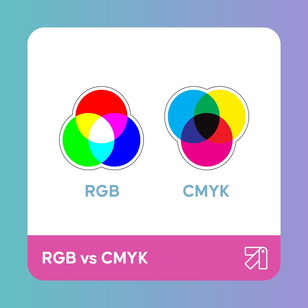
Before you start tweaking colours, you need to grasp the foundations. RGB and CMYK are the two primary colour modes used in graphics. They stand for:
- RGB: Red, Green, Blue. Often associated with digital screens and lighting, such as your computer monitor, TV, or smartphone.
- CMYK: Cyan, Magenta, Yellow, Key (Black). This colour mode is typical for print and is used in a subtractive colour model.
When To Use RGB
RGB is the go-to for anything viewed on a screen. These three primary colours are combined in various intensities to create the multitude of colours we see daily on our devices. When you need to design graphics for online platforms, RGB should be your default setting. Facebook covers, Instagram images, and web banners are just a few examples of projects where RGB is the right choice.
When To Use CMYK

A commercial printer creates prints by combining CMYK colours with physical ink. This is known as subtractive mixing and is required for most print materials, from Business Cards and Stickers.
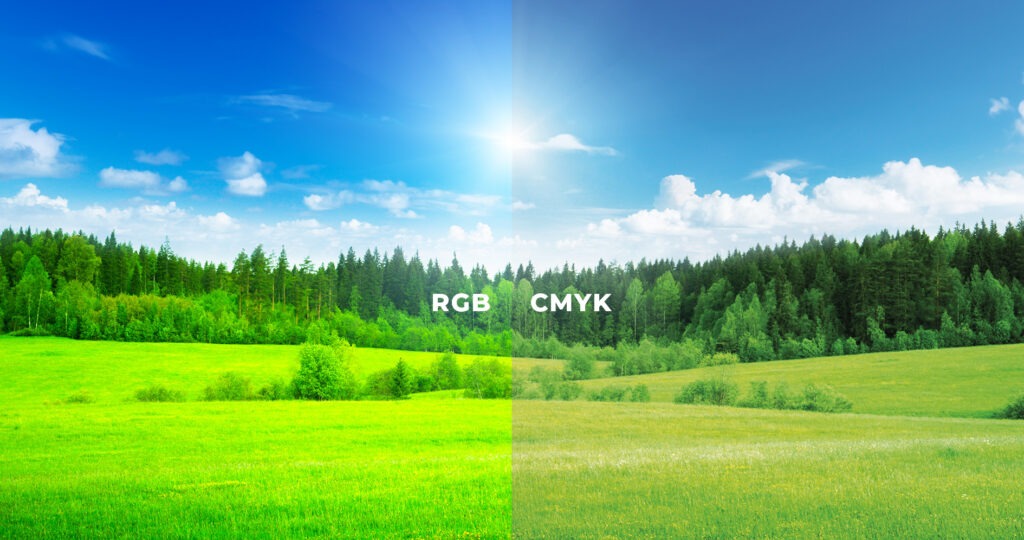
While RGB creates colour through emitted light, CMYK is used to subtract light and create colour. Hence why screen colours (RGB) may appear duller or lacking in contrast when printed.
Tip! Across our Giclée Art Prints and Photography Prints, we do ask that you supply RGB due to the specialist printer we use.
How to convert your files to CMYK
The transition from RGB to CMYK can sometimes be where the magic gets lost. If your digital creation is destined for print, you need to ensure it looks as good on paper as it does on your screen. Here’s a step-by-step guide for Adobe Photoshop:
- Select the Right Mode: If your canvas is already created, go to “Image,” then “Mode,” and select “CMYK Colour.”
- Check Those Numbers: CMYK colours have specific numerical values. Ensuring that your colours are correctly converted is crucial to expect print accuracy.
- Preview Your Design: The final confirmation is to preview your design in CMYK mode. This will give you a good idea of how your colors will appear in print.
In Adobe Illustrator, you can switch colours modes by navigating to File > Document Colour Mode > RGB Color or CMYK Colour.
When using InDesign, navigate to the Colour Panel within the software. If the panel isn’t visible, hit F6 to bring it up. Hit the dropdown symbol and select CMYK or RGB.
So there you have it. Remember, RGB for digital screens, CMYK for print. By being mindful of these distinctions, you’ll ensure that your designs look the best they possibly can!
About the author
Our in-house designer Becca has a love of all things creative. When she’s not designing, you can find her in Newcastle checking out independent coffee shops or getting her hands dirty with her house renovation.