Artwork Guides, Tips and Advice
5 tips to avoid common printing and finishing design mistakes
Preparing artwork for print can be a little daunting, even for design pros out there. We’ve put together some simple steps to help you overcome some of the most common printing and finishing design mistakes, so you’ll achieve print perfection in no time!
1. Use CMYK

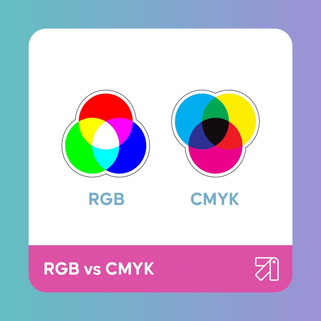
Choosing the wrong colour mode is a classic print design error. However, just always remember to stick to CMYK colour mode (cyan, magenta, yellow, black). Print documents need to contain primary colours (cyan, magenta, yellow), and black is used to mix darker shades of those colours.
Additive colour is created by mixing different light colours, with shades of red, green and blue (RGB) being the primary colours. Computer screens display this colour. But everyday colour, including print is subtractive colour (CMYK). The RGB colour spectrum is much larger than CMYK, so when printed the colour may differ from what you wanted; appearing duller is a common problem. So, when designing in Illustrator, Photoshop, whatever your design weapon of choice, make sure you swap to CMYK colour mode to have a true indication of what your design will look like printed.
We’d recommend creating a ‘rich’ black for larger, solid areas of print because printers lay colour down in, you guessed it, layers, so adding extra colour creates a deeper, richer colour. To achieve a richer black, we recommend using the formula of 40% cyan, 20% magenta, 20% yellow and 100% black. However, keep your black text sharp by sticking to using 100% black – the mix of colours don’t align well for text and will affect its sharpness.
2. Embed Fonts
If you don’t embed fonts and your document is opened on a computer that doesn’t have access to the original fonts, then they will be substituted. This isn’t exactly ideal as you don’t want them to change when printed.
You can embed/outline your fonts in Illustrator or InDesign by opening your document and highlighting the text, then select ‘Type’ in the top menu and choose ‘Create Outlines’. Your text is now grouped together in outline form – just resave your files and you’re done.
2. Include a 3mm Bleed

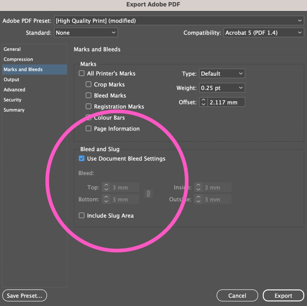
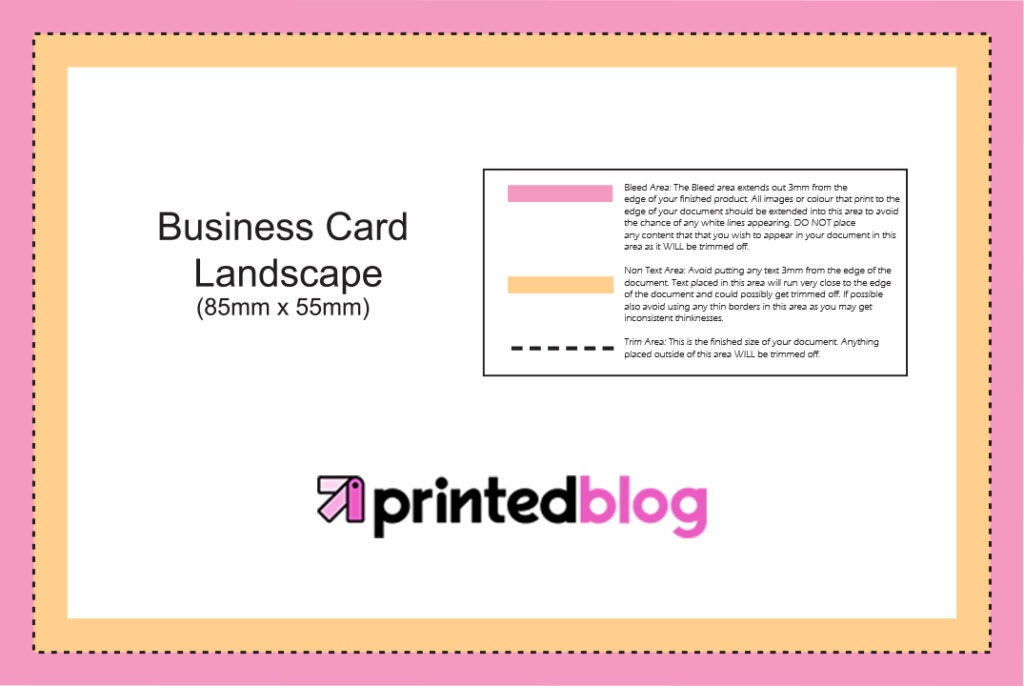
Bleed is the area of print at the edge of your design that gets trimmed off after printing. Therefore, you have to make your artwork slightly bigger. When print is cut to size, the cut isn’t always 100% accurate. So if you don’t add a 3mm bleed, you risk having a white line around the edge of your print where the artwork ends.
Some programs allow you to apply a bleed when saving artwork as a PDF. Programs that don’t have this capacity, such as PowerPoint, you’ll need to set up the page size slightly larger to accommodate a bleed. Visit this blog to understand more.
4. Include Crop Marks
Crop marks help us to understand the document size desired, and shouldn’t be added manually. Most design applications that allow PDF exports have an option to include crop marks.
5. Have a Safe Area

Ideally, please do not place text or important information on your artwork in the safe area, which is the area close to the trim marks (the orange area). There is always a little movement during print finishing and keeping artwork items away from this area ensures there’s no accidental trimming of crucial information.
If you need assistance, contact our customer service team at theteam@printed.com. We’re here to help you achieve perfect prints every time!

Comments are closed.