Inspiration
Spring Card Design Inspiration: Trends to Bloom Your Sales
Spring is finally on the horizon. After the rush of the festive season, it’s time to shake off the winter chill and look ahead to the fresh opportunities the new season brings. While Christmas is the heavy hitter, spring is packed with key retail moments such as Valentine’s Day, Mother’s Day and Easter which offer massive potential for your business.
If you’re ready to refresh your range, we’ve pulled together the essential design trends and inspiration you need to create a collection that your customers will love.
Why Spring Collections Matter
You might think you can take a breather after the December madness, but January and February are prime design time. People are looking for ways to connect, celebrate love and welcome the warmer days.
A strong spring collection does more than just fill the gap between Christmas and summer. It allows you to showcase your versatility. Whether it’s the romantic hues of February 14th or the bright optimism of Easter, these occasions let you flex different design muscles. Plus, with the right print finishes, you can transform simple designs into premium products that are worth a higher price point.
Let’s dive into the trends shaping spring Greeting Cards this year.
1. Botanical Maximalism
Florals for spring? We know, it’s not exactly ground-breaking. But this year, we’re seeing a shift away from delicate, dainty buds towards bold, botanical maximalism. Think less “English country garden” and more “overgrown jungle vibrancy.”
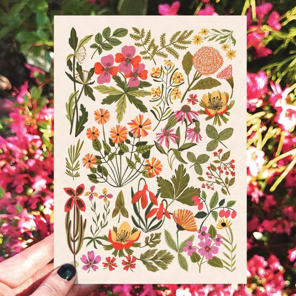
Image Credit: ZanetaAntosik
This trend is perfect for Mother’s Day cards where you want to make a strong visual statement. Instead of a single rose, why not fill the entire card front with lush greenery, oversized petals and clashing natural colours?
Design Tip: Use deep greens, punchy magentas and sunny yellows. Don’t be afraid to layer elements. If you’re illustrating, let the leaves bleed off the edge of the card to create a sense of abundance.
2. The New Romance: Modern Valentine’s
Valentine’s Day design has evolved significantly. While there will always be a market for traditional red hearts, modern buyers are often looking for something more subtle and inclusive. “Galentine’s” cards and anti-Valentine’s sentiments are gaining traction, but even for the romantics the aesthetic is changing.
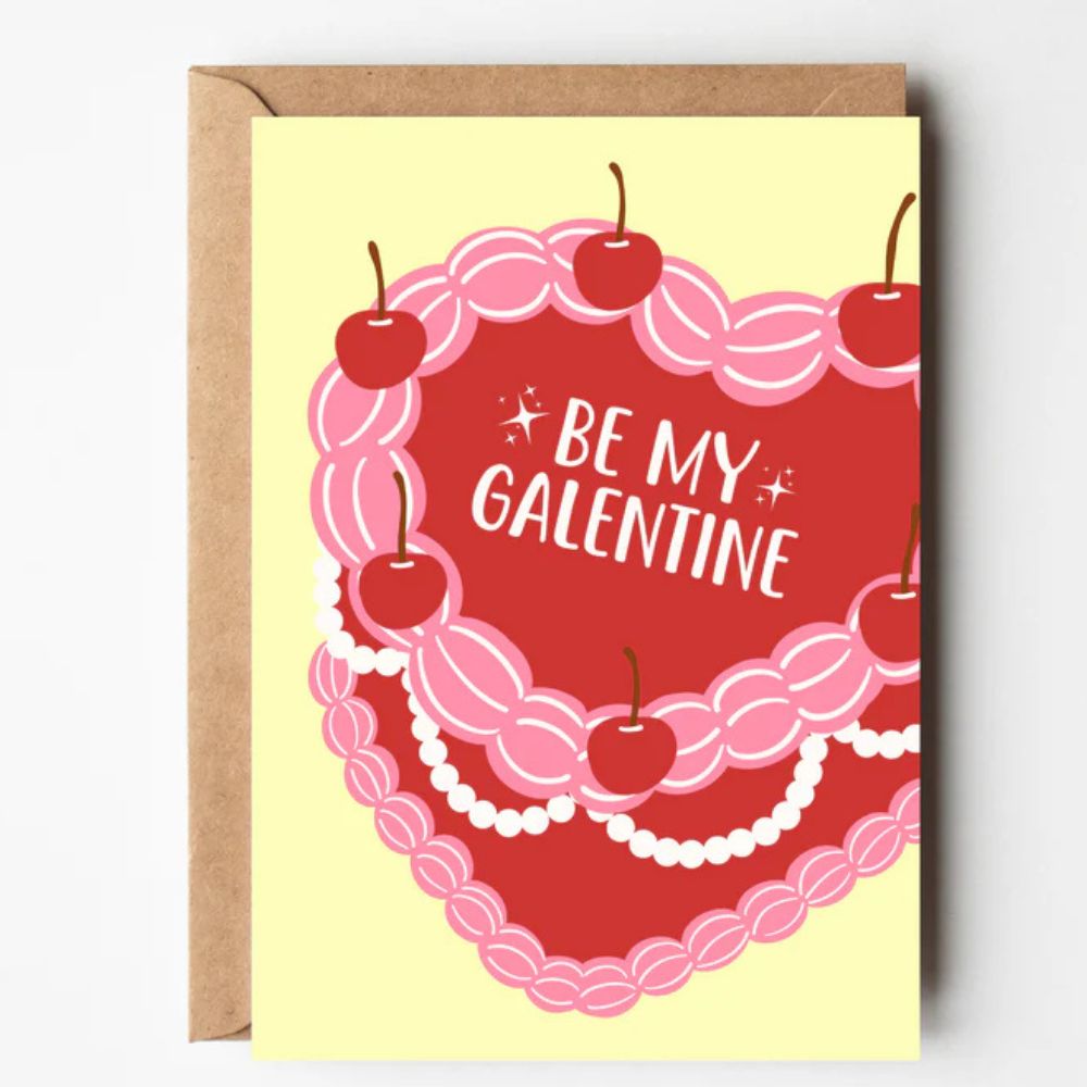
Image Credit: ByHoneyStudios
We are seeing a move towards abstract shapes and softer colour palettes. Think dusty pinks, terracotta’s and warm creams instead of primary red. Typography is key here, hand-lettered quotes or minimalist sans-serif fonts can do the heavy lifting.
Design Tip: Try combining abstract geometric shapes with a soft, warm palette. A simple message like “You’re my favourite” often sells better than a lengthy poem.
3. Playful Pastels for Easter
Easter is the moment to let your playful side shine. It’s a holiday associated with joy, new life and chocolate, so your designs should reflect that energy.
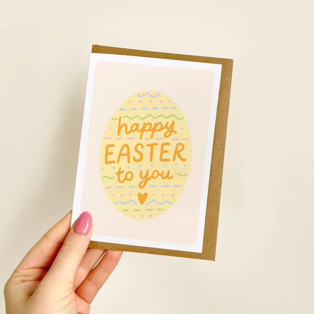
Image Credit: BWxILLUSTRATIONS
Pastels are the undisputed kings of Easter, but you can give them a modern twist. Instead of washing everything out, pair a soft lilac with a punchy lemon yellow. Or mix a cool mint green with a warm peach. Illustrations of bunnies and chicks are classics, but stylised, vector-based characters can make them feel contemporary rather than dated.
Design Tip: Consider the envelope too. A bright yellow or pastel blue envelope can make your card stand out instantly when someone opens their order.
4. Luxe Metallics and Foil
If you really want your spring collection to fly off the shelves (or virtual baskets), you need to add a touch of luxury. This is where special finishes come into their own.
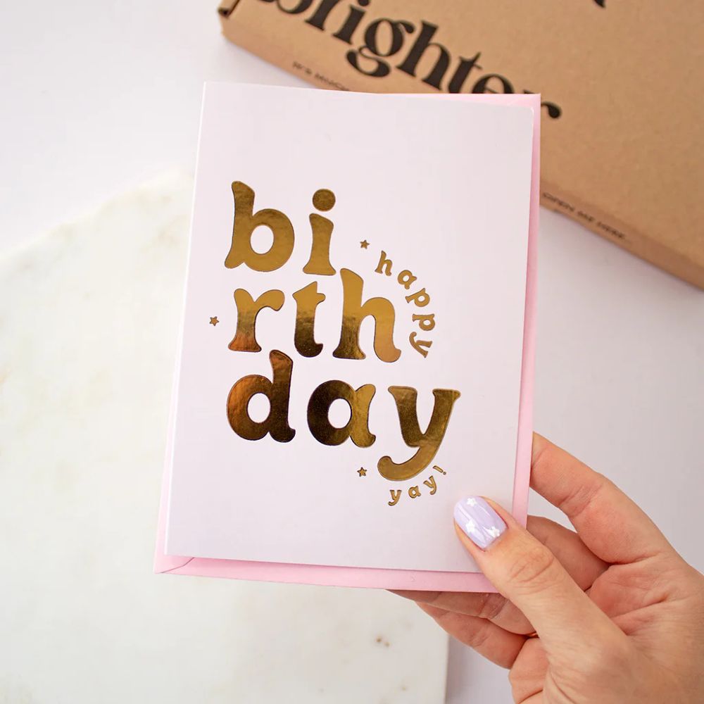
Image Credit: TreatboxUK
Foil printing isn’t just for Christmas Cards. For spring, it adds a sophisticated shimmer that catches the light and the eye.
- Gold Foil: Perfect for adding elegance to Mother’s Day calligraphy.
- Rose Gold Foil: The ideal partner for those modern Valentine’s dusky pinks.
- Silver Foil: Crisp and cool, works beautifully with fresh Easter greens and blues.
Using foil allows you to highlight specific elements of your design, like the centre of a flower, a key word in your greeting or a delicate border. It turns a standard piece of card into a tactile experience. When your customers receive a card finished with foil, that perceived value is huge.
5. Sustainable Messaging
Sustainability isn’t a trend anymore; it’s a requirement. Spring is all about nature, so it makes sense that the physical product reflects a love for the planet.
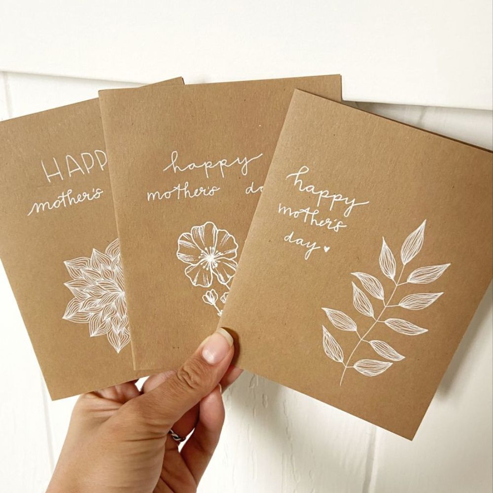
Image Credit: Ellamoonart
People are increasingly checking the back of the card to see if it’s recycled or FSC certified. Making this a core part of your brand story is powerful. Using stocks like Seed Paper, Kraft, Recycled Silk or Uncoated papers gives your cards a natural, earthy texture that complements spring designs beautifully.
Design Tip: Don’t hide your eco-credentials. Include a small icon or line of text on the back of the card stating it’s printed on recycled paper. It’s a selling point!
6. Minimalist Typography
Sometimes, the words say it all. The trend for text-heavy, image-light cards continues to grow. This is great news for designers who love typography.
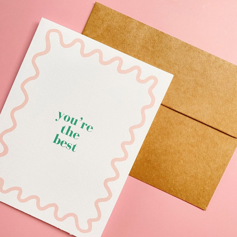
Image Credit: AllMyLoveStationery
For spring occasions, this often manifests as bold, funny or deeply sentimental statements on a plain background. The “white space” is just as important as the ink. This style works across all spring events, a stark “Happy Easter” in a chunky serif font can be just as impactful as a complex illustration.
Design Tip: Choose one or two strong typefaces and let them take centre stage. Play with font weight, size and layout for visual interest and keep your palette fresh. Try pairing classic spring shades like mint, blush or sky blue for an inviting, seasonal twist.
Getting Your Collection Ready
Once you’ve got your designs locked in, it’s time to bring them to life. As someone creating cards to sell, print quality reflects directly on your brand.
It’s also worth remembering that Birthday Cards are in demand all year round, they don’t go out of season and can beautifully complement your spring collection. By refreshing your birthday designs to feature on-trend colours, playful finishes or even little nods to spring, you can appeal to customers looking for a card for any occasion. Mixing birthday cards in with your Valentine’s, Easter and Mother’s Day ranges helps your collection feel complete and maximizes your sales potential.
We recommend ordering a Sample Pack or running a small test batch first. Check how your pastels print on uncoated paper versus silk and see how that gold foil pops against a bold background.
Spring is a season of optimism, and your cards help spread that feeling. By tapping into these trends, especially the tactile luxury of foils, you can build a range that doesn’t just sit on the shelf, but gets picked up, admired and bought.
Ready to get started? Get your spring designs uploaded and let’s make this season your most colourful one yet!
About the author
Our Marketing Campaigns Manager Hannah turns brand ideas into engaging campaigns. Off the clock, you’ll find her with a book, enjoying cosy creative hobbies, or heading to a dance class.