Inspiration, Wedding
Spring Colour Palette Trends to Refresh Your 2026 Designs
Spring is a season of renewal, making it the perfect time to refresh your wedding stationery with vibrant and stylish colours. A well-chosen palette sets the tone for your big day, whether you’re aiming for timeless elegance, playful charm, or bold sophistication.
This year, spring colour trends are moving beyond traditional neutrals, giving way to soft pastels, romantic tones, and bold contrasts inspired by fashion and design. Whether you’re planning whimsical invites or modern, editorial-style stationery, these palettes are sure to make a lasting impression.
Let’s dive into the standout colour pairings for 2026 and explore how to style them for your wedding stationery.
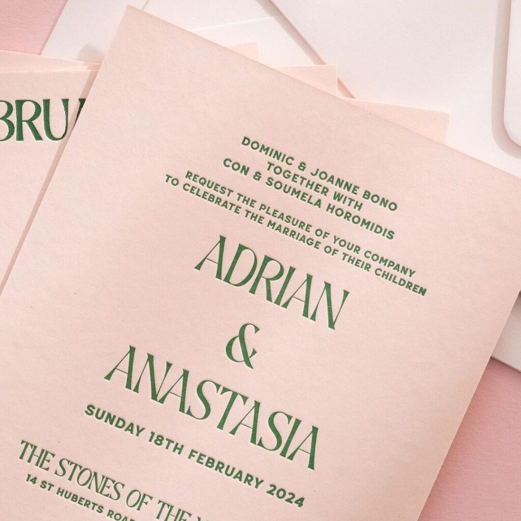
Image: Anastasia Adrian
Table of Contents
How to Use the 2026 Colours in Wedding Stationery
Colour Pairing & Styling Inspiration
The Spring Colour Palettes
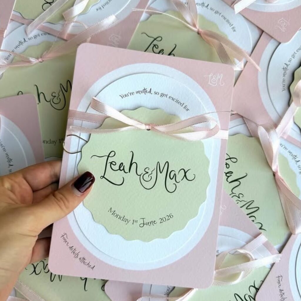
Strawberry & Matcha
When you combine the sweet, vibrant notes of strawberry pink with the grounded, earthy tones of matcha green, you get a combination that feels incredibly fresh. This pairing works so well for spring because it perfectly mirrors the natural world waking up. The pink adds a playful burst of energy, while the soft green keeps the overall look beautifully balanced.
Image: By Kate Creates
Periwinkle & Butter Yellow
If you love a softer aesthetic, this nostalgic pastel trend is absolutely lovely. Periwinkle brings a calming, slightly cool floral note, while butter yellow adds a gentle, sunshine-filled warmth. Together, they create a thoroughly uplifting and fresh atmosphere that instantly makes people smile.
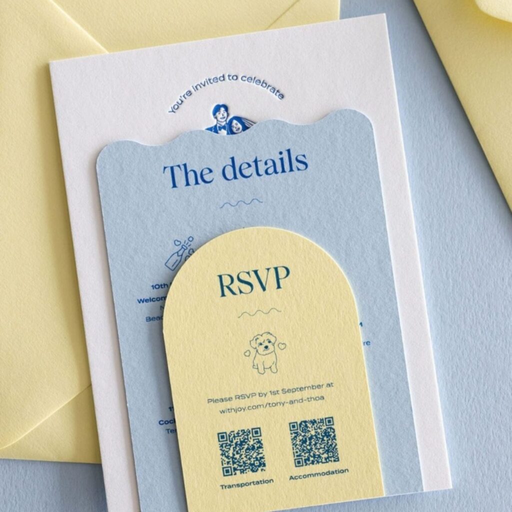
Image: Peppermint Press
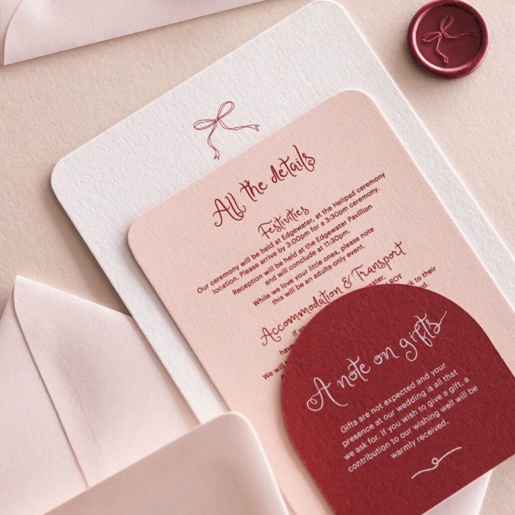
Rose Pink & Rouge
We are starting to see tonal reds stepping in to replace classic neutrals, and the result is stunning. Pairing a soft, delicate rose pink with a deep, rich rouge creates a look that is undeniably romantic but strikingly modern. It feels grown-up and luxurious without trying too hard.
Image: Peppermint Press
Violet & Coral
For those who want to make a genuine statement, this bold contrast trend for Spring/Summer 2026 is the way to go. The deep, cool intensity of violet clashes brilliantly with the bright, warm energy of coral. It gives off a highly vibrant, editorial feel that demands attention and completely energises a layout.
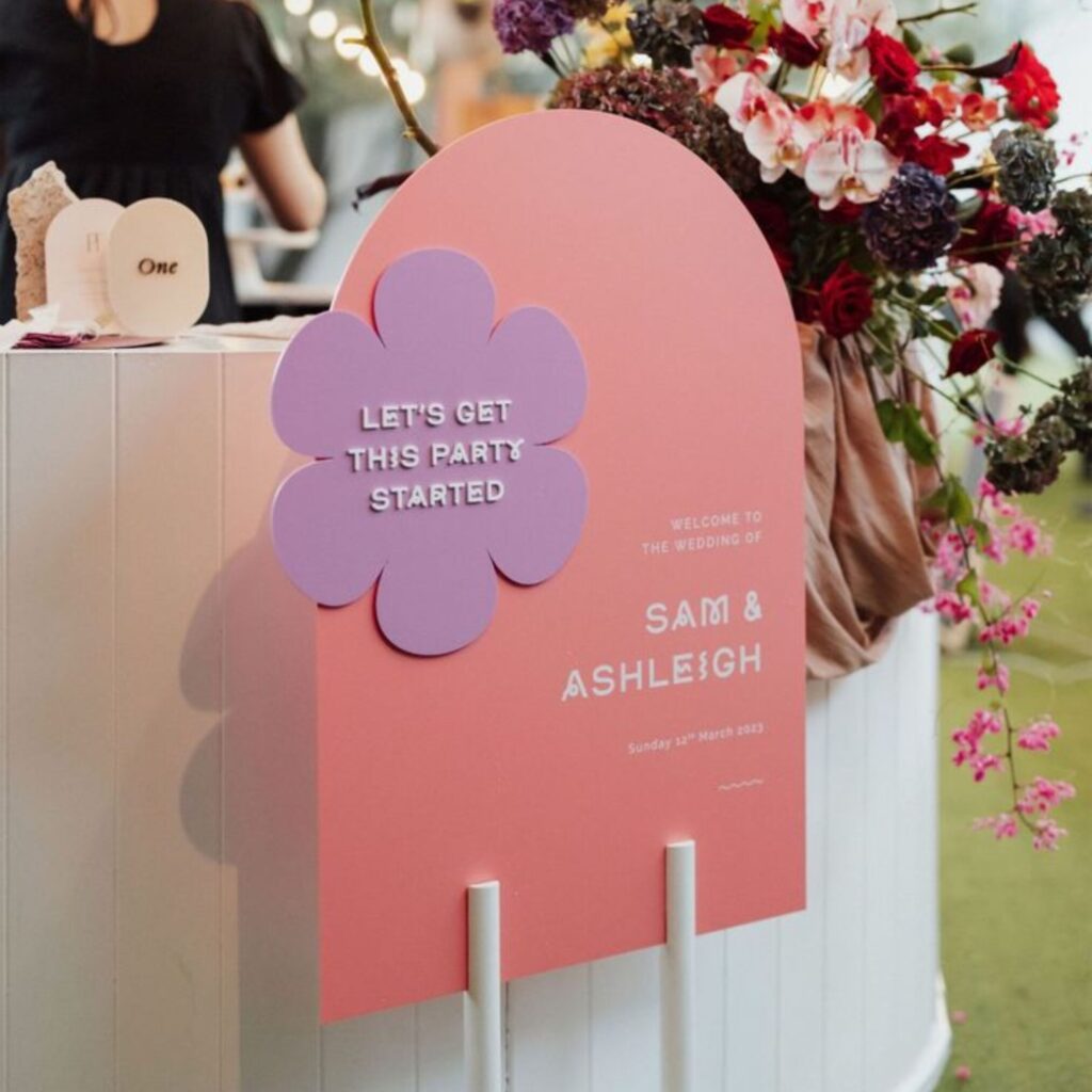
Image: Refinery Events
How to Use the 2026 Colours in Wedding Stationery
Finding the right palette is only half the fun. Knowing how to apply these colours effectively will make your designs truly sing. Here are a few simple tips to get the best results:
Pair with soft neutrals
Use whites, creams, or light greys as a neutral base to let your chosen colours pop while maintaining a sophisticated look.
Try the dominant and accent rule
Highlight one colour as the main focus and use the other as a subtle accent. For example, a butter yellow background with periwinkle details can create a balanced yet cheerful design.
Add texture and print finishes
Enhance your stationery with textured paper, vellum overlays, or special finishes like foil stamping and embossing to elevate your chosen colour palette.
Image: By Kate Creates
Colour Pairing & Styling Inspiration
- Strawberry & Matcha: Pair with floral illustrations or botanical patterns for a garden-inspired theme.
- Periwinkle & Butter Yellow: Create light, airy designs with watercolor effects or soft brush strokes.
- Rose Pink & Rouge: Add gold or silver foil details for a touch of glamour.
- Violet & Coral: Use geometric patterns or bold typography for a modern, editorial edge.
Tips for Brides & Grooms
- Match Your Stationery to Your Wedding Theme: Ensure your colour palette complements the overall vibe of your venue, décor, and attire.
- Order Samples: Test how the colours look on different paper types and finishes before placing your final order.
- Plan Ahead: Give yourself plenty of time to design, review, and finalize your stationery to avoid last-minute stress.
Celebrate Your Love with Fresh Spring Design
Spring wedding stationery is all about optimism and timeless beauty. By embracing one of these stunning colour palettes, you’ll create designs that reflect your unique love story and leave a lasting impression on your guests.
Ready to bring your vision to life? Start designing your dream wedding stationery today with these inspiring 2026 spring colour trends!
About the author
Meet Tasmine, our Social Media & Content Manager! When she’s not busy creating content, she’s out on a run, enjoying iced coffee, or daydreaming about Daschunds.