News
White ink postcards: what you need to know
White Ink business cards have been around for a while now, but it is time for a fresh collaboration – White Ink for postcards.
Innovative White Ink postcards give you the perfect opportunity to flex your design muscles and earn some serious creative kudos. Combine this sophisticated, striking finish with a choice of five striking uncoated coloured papers and you’re onto a real client-impressing winner.
So how can you make the most of this ice cool buddy for postcard perfection? We have a quick fire guide on this printing process right here.
What’s White Ink when it’s at home?
You may be well acquainted with printing’s four main stars, CMYK (cyan, magenta, yellow and black). The entire spectrum of printed colours are made up of these magnificent four…but not white. This elusive beast used to be rarer than a genuine yeti sighting until now.
The kind of White Ink printing we offer is what print pros refer to as ‘spot white’. This basically means that the white ink appears as a colour in a design or is used as a highlight in a coloured design, like printing a white flower onto a coloured paper stock, for example. Because white is a light coloured ink, we need to make several passes to layer the ink up and get a stronger colour, which means the finished effect won’t be ‘paper white’ or opaque against the coloured card.
Why go white?
By adding white as the fifth colour in the CMYK printing process, you can enjoy all the colours you normally design with, but on a heavily pigmented substrate. This means getting effects like striking white text on black card.
Using white ink in your designs frees you up to all sorts of exciting creative opportunities. Instead of being limited to white or cream paper stocks, you can use vibrant, brightly coloured stocks and still get white colour in your artwork. Without White Ink, the elements you colour white in your design will simply show as the colour of the paper underneath.
Get set for White Ink
Creating artwork with White Ink takes a little more jiggery pokery than the average print order. Because it’s a fancy fifth colour on the printing press, we’ll need your artwork file set up in a certain way so our system can read it properly. Without properly formatting your artwork file, there’s a good chance your finished print won’t come out the way you want it to, and that’s no fun for anyone. To make sure you folks can get set up, we created this downloadable artwork guide.
Meet the white ink paper stocks
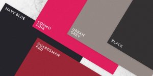
Already doing the rounds are:
- Guardsman red uncoated
It’s warm, invigorating and undoubtedly the colour of inspiration—turn your print into a tangerine machine with this juicy orange shade.
- Black uncoated
It never goes out of fashion and it’s slimming! This shade of paper suits luxury brands and those that love a dash of darkness with their designs.
- Cosmo pink uncoated
We love a bit of magenta down at printed.com, so when we saw this punchy pink number, we couldn’t resist. This is definitely a shade for designs that need to bring the sass.
And the new boys in town are:

- Urban grey uncoated
You can’t get cooler than urban grey. Edgy, sophisticated and classic, this pigment works for both out of the ordinary and chic designs.
- Royal blue uncoated
It isn’t called royal for no reason! This colour exudes regal quality and smacks home your messages with its bold pigmentation. Perfect for poshness and brashness alike, you can’t wrong with true blue.
Get excited, but be as ice cool as white ink. Quite frankly if one of you doesn’t send us a White Ink postcard to say thanks, we’ll be devastated.
Inspired by White? Read more about this show stopping print superstar here!
About the author
Meet Tasmine, our Social Media & Content Manager! When she’s not busy creating content, she’s out on a run, enjoying iced coffee, or daydreaming about Daschunds.
Comments are closed.