Inspiration, Tips and Advice
How to Re-create the Iconic American Psycho Business Card
Ever scrolled through TikTok and seen someone re-create that scene from American Psycho? You know the one. Patrick Bateman’s iconic Pierce & Pierce Business Card continues to fascinate us, even decades after the film’s release. If you’ve found yourself thinking about how to create your own version of cinema’s most famous piece of stationery, you’re in the right spot!
In this guide, we’ll walk you through everything you need to know to recreate the Patrick Bateman Business Card. We’ll cover all the details, from finding the perfect “bone” coloured paper to getting that subtle yet sinister font just right. Whether you’re a design lover, a film fanatic, or just want to make a killer impression at your next networking event, don’t worry, we’ve got you covered.
American Psycho (2000)
The Iconic American Psycho Business Card Scene
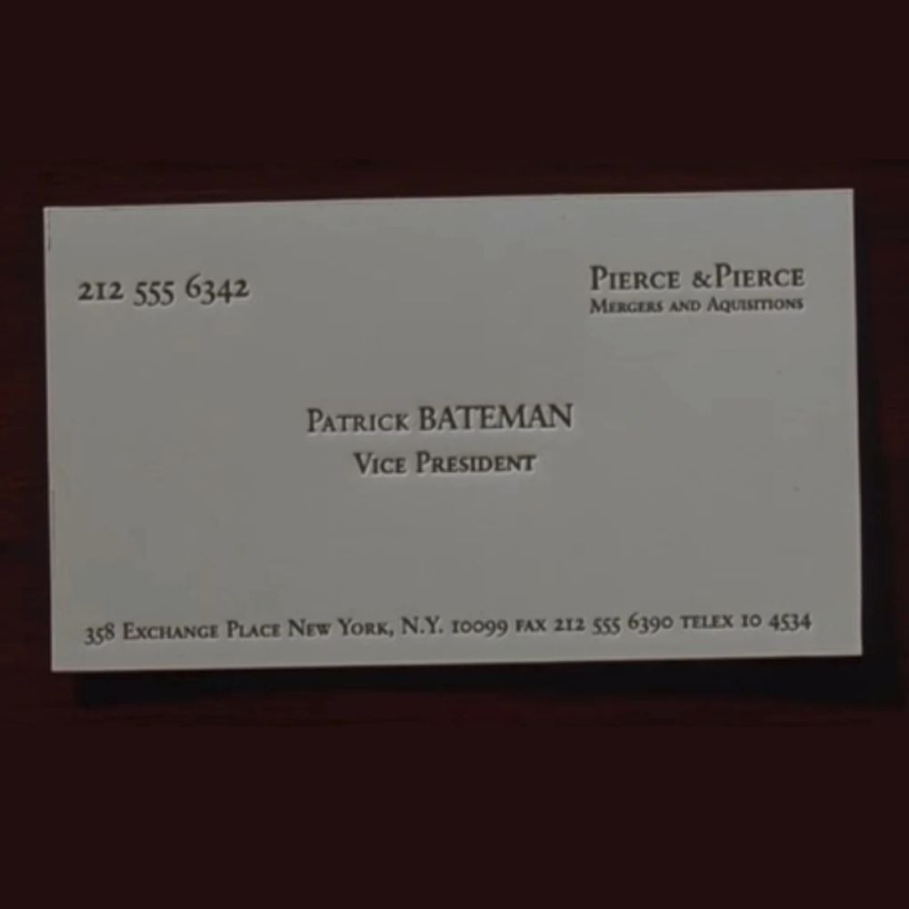
Four Wall Street executives gathered around a sleek, cold conference table at Pierce & Pierce. Each one is convinced their Business Card is the absolute best, the pinnacle of Business Card design. The air gets thicker with tension as they slowly, almost theatrically, reveal their cards one by one. Meanwhile, Patrick Bateman’s internal monologue grows increasingly… well, unhinged.
He famously muses: “Look at that subtle off-white colouring. The tasteful thickness of it. Oh my God, it even has a watermark.”
This American Psycho Business Card quote has truly become legendary! It perfectly nails that absurd corporate competition, which, let’s be honest, is a huge part of the film’s dark humour. Every card isn’t just a piece of paper; it’s a weapon in this psychological battle.
Every tiny detail, the texture, the typeface, even the precise shade of white, is scrutinised with an almost obsessive intensity.
The scene brilliantly uses these Business Cards to expose the shallow materialism and competitive anxiety that pretty much defines these characters. It’s no surprise the Business Card scene from American Psycho is so iconic, it’s both hilariously over-the-top and deeply unsettling all at once.
Here’s How to Create Your Own
Choosing Your Paper Stock
Patrick Bateman’s card famously features “bone” coloured paper with a subtle texture that screams luxury without saying a word. Getting this element right is crucial to nailing the authentic look.
For the perfect recreation, consider these paper options:
Patrick Bateman’s card famously features “bone” coloured paper with a subtle texture that screams luxury without saying a word. Getting this element right is crucial to nailing the authentic look.
For the perfect recreation, consider these premium paper options:
- Cotton Paper is your best bet for replicating Bateman’s card. The original was 100% cotton, known for its luxurious, soft feel. Our cotton paper choice perfectly captures that distinctive texture and high-quality finish.
- Tintoretto Gesso this finest Italian paper stock delivers a warm off-white hue with a distinctive hammered finish that brings instant prestige to any design. Available in 300gsm, it provides the substantial feel that makes each card feel important in your hands.
- Rives Shetland brings a unique weave-like texture across its bright white surface. The stylish uncoated finish adds a sophisticated tactile element that contemporary professionals will appreciate. Available in 250gsm, it offers excellent quality whilst being slightly lighter than the Italian options.
- Uncoated paper is an understated choice, offering a soft, touchable texture that’s also great for writing on. It gives print colours a sophisticated, slightly muted finish, which we found perfect for our replica.
No matter which one you choose, you can be confident that your business card will have that substantial, premium feel you’re looking for.
Mastering the Typography
The Patrick Bateman Business Card uses what the movie calls “Silian Rail lettering”, a fictional font name. For an authentic recreation, we recommend Garamond, a typeface that closely mirrors classics like Baskerville or Copperplate Gothic.
Here’s how to nail the look:
- Use 10pt or 12pt font in all caps.
- Add precise letter spacing to achieve a refined, architectural feel where every detail feels intentional.
Keep the layout clean and purposeful:
- Full Name
- Job Title
- Company Name
- Business Address
- Phone Number
Avoid modern touches like email addresses, social media, or QR codes. These would break the timeless, old-money vibe that makes these cards iconic.
Overall Design
The secret to the American Psycho Business Card’s impact? It’s all about what you don’t include, as much as what you do. We’re talking classic charcoal grey or rich black ink, that’s it. No vibrant colours, no gradients, no flashy elements that scream for attention. This keeps things sleek and sophisticated.
For that super clean, sharp finish, digital printing is your best friend. It ensures every letter looks crisp and precise. This monochromatic choice helps your card exude respect through sheer sophistication, rather than any kind of showiness.
Want to take it up a notch and really nail that authentic, premium feel? Consider adding embossing, or even debossing to add something unique, through our Bespoke Service. The subtle texture and elegant shadow play of embossed text add another layer of tactile luxury.
Sizing Considerations
Standard UK Business Cards measure 85mm x 55mm, but if you want to embrace the full American corporate drama, opt for 90mm x 55mm, the closest available match to US standard sizing.
The slightly larger format adds visual impact and feels more substantial in hand, which aligns perfectly with the character’s attention to impressive details.
Here Are Our Replicas and Exactly What We Used
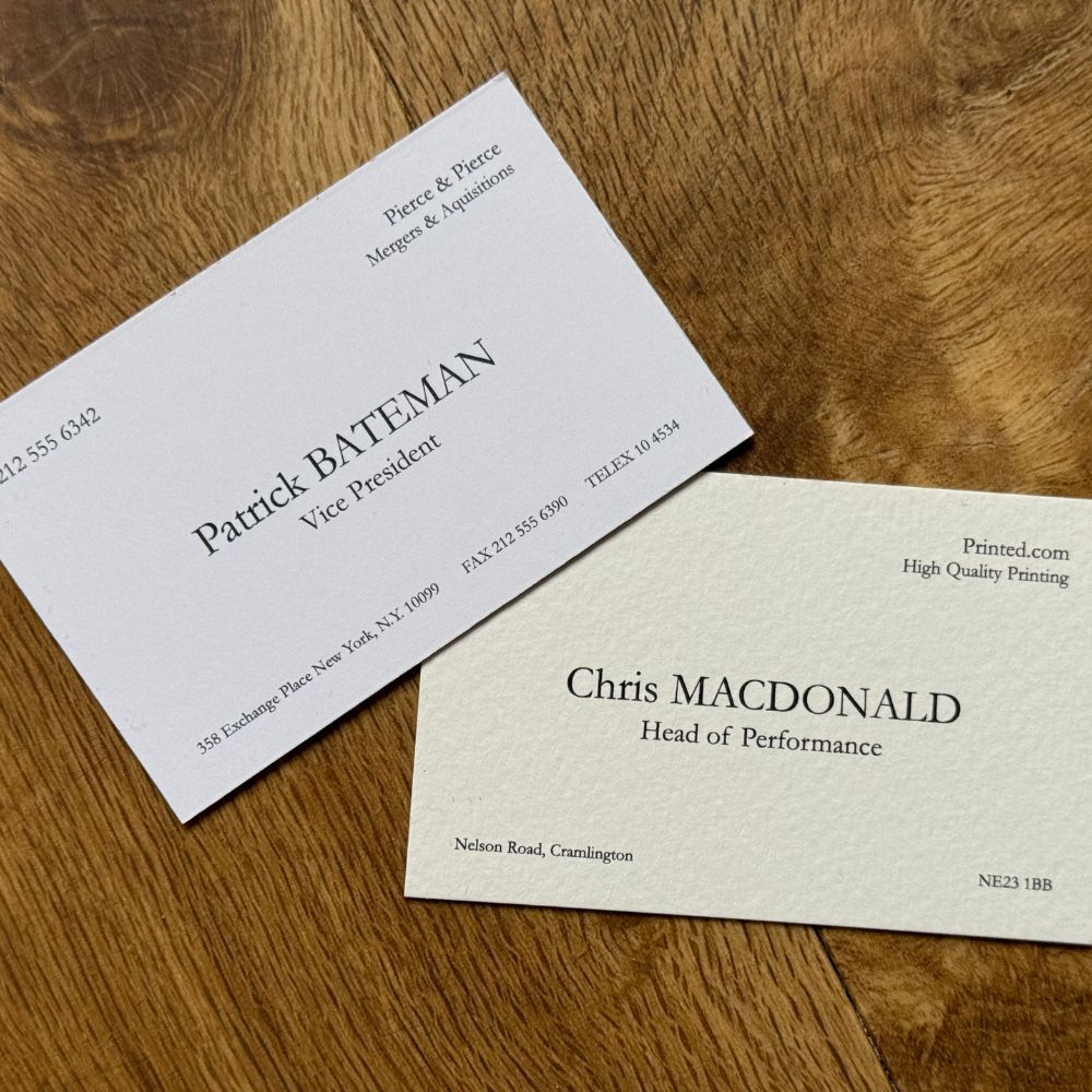
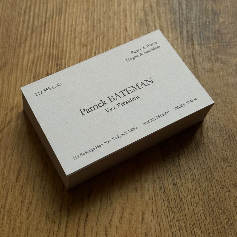
Patrick Bateman Business Card:
- Font: Garamond
- Paper stock: Uncoated 400gsm
- Size: 85mm x 55mm
Chris MacDonald Head of Performance at Printed.com Business Card:
- Font: Garamond:
- Paper stock: Tintoretto Gesso 300gsm
- Size: 85mm x 55mm
Why Business Cards Matter More Than Ever
Even in our super digital world, a really well-made Business Card is still one of the best tangible ways to make a memorable first impression. Think about it – physical cards create those genuine human connection moments that digital just can’t quite replicate. They encourage eye contact, spark conversation, and give people something real to remember you by.
It’s all about appreciating quality craftsmanship and attention to detail, right? And seriously, nobody understood that better than Patrick Bateman.
Time to Make Your Mark
Crafting the ultimate American Psycho inspired Business Card, is all about precision and attention to detail. Think premium paper stock, clean typography, a subtle colour palette, and flawless print quality. Every element should work together to convey confidence and professionalism without overdoing it.
Ready to design a Business Card that’s truly iconic? Start today and see how the perfect print can turn a simple introduction into a lasting impression.
About the author
Meet Drew! As part of the Printed.com marketing team, Drew spends her days crafting content. When she’s not working her magic on marketing, you’ll find her enjoying quality time with her daughter and her furry friend, Archie.